Agglomerative Hierarchical Clustering
““Hierarchies are celestial. In hell all are equal.””
Introduction:
The need to pre-specify the number of clusters is an often cited disadvantage of k-means clustering. A frequent alternative without that requirement is hierarchical or agglomerative clustering. Hierarchical clustering can be depicted as a tree-based visual called dendrogram, which appears as an upside down tree that combines clusters of branches as we move up toward the trunk.
Using a DendRogram:
Each leaf at the bottom of a dendrogram represents an observation. As we move up from the bottom observations, we see that some of them merge into branches, which in turn merge into larger branches. Groups are considered to be very similar if they merge together more quickly and earlier. In contrast, branches that merge later are generally more different from each other and they will be higher on the tree.
The length of branches are also important, as significantly different branches tend to fuse together with higher vertical distances. Horizontally close observations may not be similar to each other if they are at different levels on the tree.
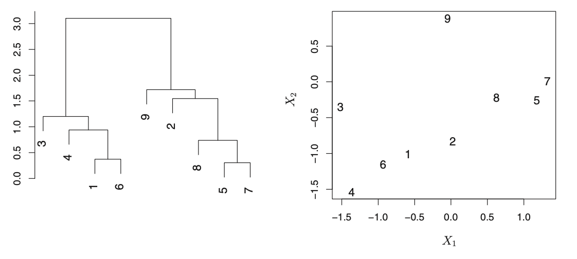
The dendrogram shows observations that are very similar to each other: 5 and 7 as well as 1 and 6 are similar. However, 2 and 9 are dissimilar. In fact, 9 is as similar to 2 as it is to 8, 5, and 7. While 9 and 2 are close together (horizontally) 2, 8, 5, and 7 all fuse with observation 9 at the same height.
Source: An Introduction to Statistical Learning (James, Witen, Hastie, Tibsirani)
Identifying clusters can be done by making a horizontal cut across the dendrogram. The sets of observations below the cut are considered distinct clusters. Any number of clusters can be created between 1 and n (the number of observations) by cutting at a lower level on the tree. The decision on where to cut on the dendrogram is based on visual inspection of the heights of merged branches and the desire of the analyst.
Hierarchical clustering and linkage:
Hierarchical clustering starts by using a dissimilarity measure between each pair of observations. Observations that are most similar to each other are merged to form their own clusters. The algorithm then considers the next pair and iterates until the entire dataset is merged into a single cluster. Dissimilarity is based on a concept called linkage. There are several linkage methods available, but complete, average, and single are most frequently used. Balanced dendrograms are preferred, therefore the linkage that produces the most balanced dendrogram would be preferred.
The linkage criterion is responsible for selecting the distance between sets of observations. Sklearn.cluster.AgglomeratriveClustering will merge pairs into a cluster if it minimizes the linkage criterion. When using sklearn, the following linkage choices are available: Ward (this is the default), complete, average and single.
| Linkage | Description |
|---|---|
| Complete | Maximal intercluster dissimilarity Compute pairwise dissimilarities between observations in two clusters and record the largest of dissimilarities Complete or maximum linkage uses the maximum distances between all observations of the two sets |
| Single | Minimal intercluster dissimilarity Compute pairwise dissimilarities between observations in two clusters and record the smallest of dissimilarities Single uses the minimum of the distances between all observations of the two sets. |
| Average | Mean intercluster dissimilarity Compute pairwise dissimilarities between observations in two clusters and record the average of dissimilarities Uses the average of the distances of each observation of the two sets |
| Ward | Minimizes the variance of the clusters being merged |
The measure of dissimilarity can also be specified. Available measures can be Euclidean distance or correlation between two observations or some other metric, but a choice will have a major impact on the developing dendrogram. Available metrics in sklearn are euclidean, l1, l2, manhattan, cosine or precomputed. (When using the Ward linkage, only euclidean is available. Also, if the metric is specified as precomputed a distance matrix is required for model fitting.)
Further, standardizing the dataset is also advised. While sometimes standardization may not be necessary, in practice it is often practical (required).
Recency-Frequency-Monetary Value (RFM) Segmentation:
In this section, a segmentation of a donor list from a not-for-profit organization was completed using hierarchical clustering. This is the same dataset that was used for k-means clustering, which will allow us to contrast the results of hierarchical clustering to that of k-means clustering from a business perspective. Please click to see k-means clustering results.
As a reminder, RFM segmentation allows marketing and sales organizations to prioritize their customers based on three quantitative metrics:
How recently have customers purchased a company’s product or service? (Recency)
How frequently have customers purchased a company’s product or service? (Frequency)
What was the value of purchases by customers? (Monetary Value)
The three variables are defined as follows:
Recency: Recency is defined by the number of months passed since a donor’s last donation. The dataset contains 40 months of activity, and recency is converted to the number of months between the first month in the dataset to the date of last donation.
Frequency: Frequency is defined by the number occasions a donor donated at least $1 during the most recent 40 month period. Frequency is computed by dividing the dollar amount of lifetime gifts to date by the average dollar amount of gifts to date.
Monetary Value: Monetary value represents the total amount of money donated during the 40 months available.
As usual, the required modules and the dataset need to be loaded, and the data needs to be processed. The section below shows the computation of variables when needed and the scaling of data. The MinMax scaler is used to standardize the variables so that they are expressed on the same scale. In this case, each feature is individually scaled to range between zero and one.
import pandas as pd
import numpy as np
import matplotlib.pyplot as plt
from sklearn.cluster import AgglomerativeClustering
from sklearn.cluster import KMeans
from sklearn.preprocessing import StandardScaler, normalize
from sklearn.preprocessing import MinMaxScaler
import mpl_toolkits.mplot3d.axes3d as p3
import scipy.cluster.hierarchy as sch
import seaborn as sns
charity_df = pd.read_csv('charity.csv') #read csv file
charity_df=charity_df.dropna() #remove all lines with missing observations
charity_df=charity_df[charity_df['donr'] == 1] #drop non-donors

charity_df['recency']=40-charity_df['tdon'] #recency
charity_df['frequency']=charity_df.tgif/charity_df.agif #frequency
charity_df.rename(columns = {'tgif':'value'}, inplace = True) #value
clustering_df = charity_df[['recency','frequency', 'value']]
scaler = MinMaxScaler(feature_range=(0,1))

clustering_df=pd.DataFrame(scaler.fit_transform(clustering_df), columns=clustering_df.columns)
DENDROGRAM:
We can create an initial dendrogram based on the charity dataset. On this dendrogram, the entire tree structure is shown. The plotting of a dendrogram can be done using scipy. The parameters and how to use them are available on the scipy.cluster.hierarchy.dendrogram page.
The section, “Hierarchical clustering and linkage” above contains a table describing four different linkage options. Here, we can see the influence of four possible linkage criteria offered by Sklearn. As discussed, the linkage criterion is responsible for selecting how the distance is computed when selecting observations to be merged. When merging pairs of observations, the goal is always to minimize the linkage criterion.
Ward linkage minimizes the variance of merged clusters;
Average linkage is based on averaging the distance of all observations of two sets considered for fusing;
Complete linkage maximizes the distances between observations of two sets considered for fusing; and
Single linkage minimizes the distances between observations of two sets considered for fusing.
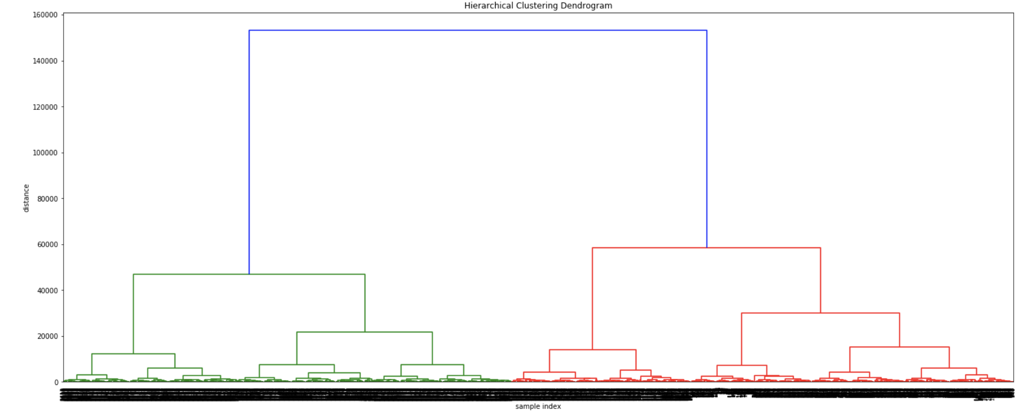
The dendrograms below illustrate the differences among the four linkage approaches. Note that default in sklearn.cluster.AgglomerativeClustering is ward. Given that segment numbers can be determined by cutting the dendrogram at a specific point, the four approaches may result in very different clustering solutions. For example, the tree representing ward linkage suggests that a four (or possibly a five) cluster solution may be appropriate, the tree with the single linkage suggests a two cluster solution. The average and complete linkage based dendrograms both suggest a five cluster solution.
If a balanced output is important, Ward provides a very good option. Unfortunately affinity (or distance metric) can not be varied with Ward, so the average linkage is a good approach instead.
In order to demonstrate the differences in counts of donors by segment via the four different linkage types, a four cluster solution was chosen. (As discussed a few seconds ago, different linkage solutions may actually require the implementation of more or fewer segments.)
Finally, note that the dendrograms were truncated for clarity, a feature offered by scipy. By the way, if balanced cluster sizes are important to the analyst, trunkating at an earlier branch may be beneficial since the number of points in a node can be printed as shown below.
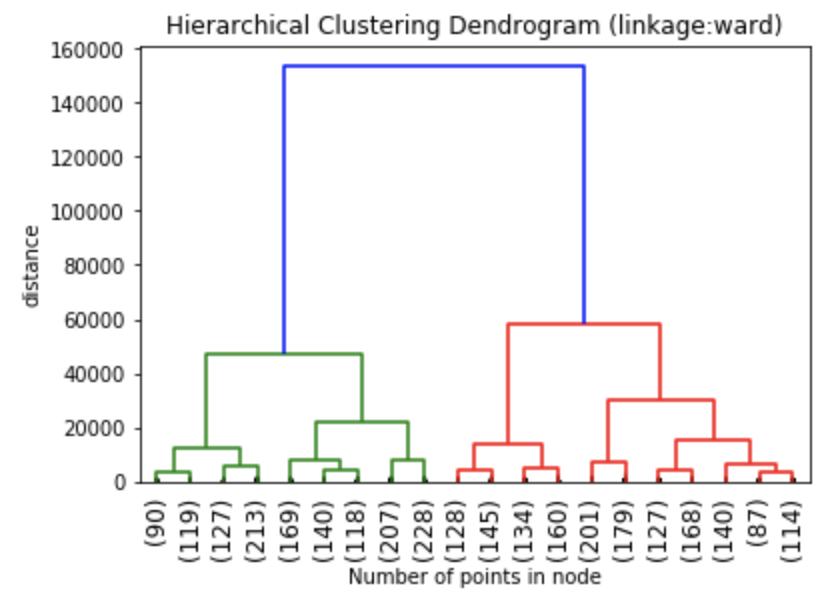
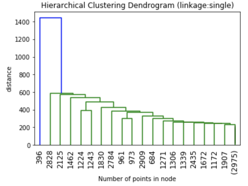
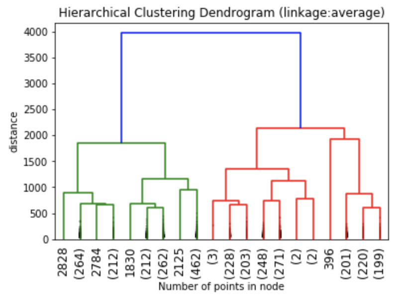
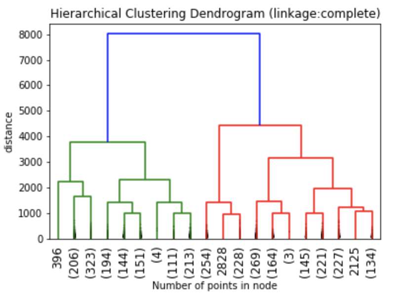
Z1 = linkage(charity_df, 'ward')
Z2 = linkage(charity_df, 'single')
Z3 = linkage(charity_df, 'average')
Z4 = linkage(charity_df, 'complete')

plt.title('Hierarchical Clustering Dendrogram (linkage:ward)')
plt.xlabel("Number of points in node")
plt.ylabel('distance')
dendrogram(
    Z1,  #enter Z1, Z2, Z3 or Z4 depending on desired linkage criterion
    truncate_mode='lastp',  # show only the last p merged clusters
    p=20,  # show only the last p merged clusters, lower it if interested seeing how balanced the solution is
    leaf_rotation=90.,
    leaf_font_size=12.,
    show_contracted=True,  # to get a distribution impression in truncated branches

)
plt.show()
Linkage and Affinity:
Linkage and affinity have a significant impact on the cluster solution. We can already see the graphical differences among the four dendrograms representing four different linkage solutions above. Now we can quantify, how the frequency of individual observations change with choices of linkage and affinity.
model1 = AgglomerativeClustering(n_clusters=4, affinity='euclidean', linkage='ward')
model2 = AgglomerativeClustering(n_clusters=4, affinity='euclidean', linkage='single')
model3 = AgglomerativeClustering(n_clusters=4, affinity='euclidean', linkage='average')
model4 = AgglomerativeClustering(n_clusters=4, affinity='euclidean', linkage='complete')

model2.fit(clustering_df)
clustering_df['clus_membership1']=model2.labels_ #this is used for plotting later

#Predict and count numbers in each cluster
clus_solution1 = model1.fit_predict(clustering_df)
clus_solution2 = model2.fit_predict(clustering_df)
clus_solution3 = model3.fit_predict(clustering_df)
clus_solution4 = model4.fit_predict(clustering_df)

output1 = pd.DataFrame(data=clus_solution1)
output2 = pd.DataFrame(data=clus_solution2)
output3 = pd.DataFrame(data=clus_solution3)
output4 = pd.DataFrame(data=clus_solution4)

A=output1[0].value_counts(ascending=False)
B=output2[0].value_counts(ascending=False)
C=output3[0].value_counts(ascending=False)
D=output4[0].value_counts(ascending=False)

out=pd.concat([A,B,C,D], axis=1)
out.columns = ['ward', 'single', 'average', 'complete']
print(out)
The table below shows the number of individuals in each cluster. The clustering approach using ward linkage (model A) had four clusters, while the single linkage solution (model B) had two clusters. The clustering algorithm using average(model C) and complete linkage (model D) both resulted in five clusters.
Model A was nicely balanced, while model B was skewed and had the majority of donors in a single cluster. Models C and D resulted in essentially the same solution. These solutions were very similar to model A except one cluster was inefficiently broken into two sub-clusters. (One cluster had 340 cases, while an other cluster had only 1 case.). From a marketing and sales perspective, model A is the most attractive.
| ward | single | average | complete | |
|---|---|---|---|---|
| 0 | 986.0 | 2166.0 | 986 | 986 |
| 1 | 341.0 | 828.0 | 340 | 340 |
| 2 | 828.0 | NaN | 1 | 839 |
| 3 | 839.0 | NaN | 828 | 1 |
| 4 | NaN | NaN | 839 | 828 |
Next, we take a look at the role of the affinity metric in how pairs of observations are fused together. Affinity is the metric that is used to compute the linkage. There are five different criteria are available in sklearn.cluster.AgglomerativeClustering: euclidean, l1, l2, manhattan and cosine. A precomputed option is also available if an analyst wants to use a pre-specified matrix. The default is euclidean. As with the linkage criterion, the affinity criterion may also impact the clustering solution. Take a look at the following example from the charity dataset. The ward linkage only works with euclidean distances. As a result, I used the “single” linkage and I kept the number of clusters at four for consistency. This does not mean that I would use a four cluster solution with the single linkage!
model1_A = AgglomerativeClustering(n_clusters=4, affinity='euclidean', linkage='ward')
model1_B = AgglomerativeClustering(n_clusters=4, affinity='l1', linkage='single')
model1_C = AgglomerativeClustering(n_clusters=4, affinity='l2', linkage='single')
model1_D = AgglomerativeClustering(n_clusters=4, affinity='manhattan', linkage='single')
model1_E = AgglomerativeClustering(n_clusters=4, affinity='cosine', linkage='single')

clus_solution1_A = model1_A.fit_predict(clustering_df)
clus_solution1_B = model1_B.fit_predict(clustering_df)
clus_solution1_C = model1_C.fit_predict(clustering_df)
clus_solution1_D = model1_D.fit_predict(clustering_df)
clus_solution1_E = model1_E.fit_predict(clustering_df)

output1_A = pd.DataFrame(data=clus_solution1_A)
output1_B = pd.DataFrame(data=clus_solution1_B)
output1_C = pd.DataFrame(data=clus_solution1_C)
output1_D = pd.DataFrame(data=clus_solution1_D)
output1_E = pd.DataFrame(data=clus_solution1_E)

a=output1_A[0].value_counts(ascending=False)
b=output1_B[0].value_counts(ascending=False)
c=output1_C[0].value_counts(ascending=False)
d=output1_D[0].value_counts(ascending=False)
e=output1_E[0].value_counts(ascending=False)

out=pd.concat([a,b,c,d,e], axis=1)
out.columns = ['euclidean', 'l1', 'l2', 'manhattan', 'cosine']
print(out)
While the choice of affinity metric did not have a differential impact when the criterion was specified as euclidean, l1, l2 or manhattan, the segmentation solution was considerably different when the affinity metric was set to cosine.
The segmentation solution with the cosine affinity criterion is not useful for marketing or sales programs. Still, it is clear that the choices available for the affinity and linkage criteria are versatile tools when attempting to segment a dataset. Trying different configurations with various segment numbers are likely to result in at least one solution that will be acceptable for production.
| euclidean | 11 | 12 | manhattan | cosine | |
| 0 | 986 | 341 | 341 | 341 | 984 |
| 1 | 341 | 986 | 986 | 986 | 2007 |
| 2 | 828 | 839 | 839 | 839 | 2 |
| 3 | 839 | 828 | 828 | 828 | 1 |
So let’s plot our segmentation solution and profile the segments. Remember that clus_membership1 represents a four segment solution that was obtained with the single linkage and euclidean affinity metric.
from mpl_toolkits import mplot3d
%matplotlib inline
import numpy as np
import matplotlib.pyplot as plt

fig = plt.figure(figsize=(8, 8))
ax = fig.add_subplot(111, projection='3d')

# Data for three-dimensional scattered points
zdata = clustering_df['value']
xdata = clustering_df['frequency']
ydata = clustering_df['recency']
ax.scatter3D(xdata, ydata, zdata, s=5, alpha=0.6, c=clustering_df['clus_membership1'], cmap='magma');

ax.set_xlabel('Frequency')
ax.set_ylabel('Recency')
ax.set_zlabel('Value')
Even visual inspection of the three dimensional plot of cases resulting from agglomerative hierarchical clustering shows that the segments are considerably different from a solution based on k-means clustering. (For the k-means solution please click here.)


We can also inspect a two dimensional depiction of the hierarchical clustering solution. Value and recency together appear to be strongly differentiated. However, clusters 2 and 3 are similar when plotted based on value vs. frequency.
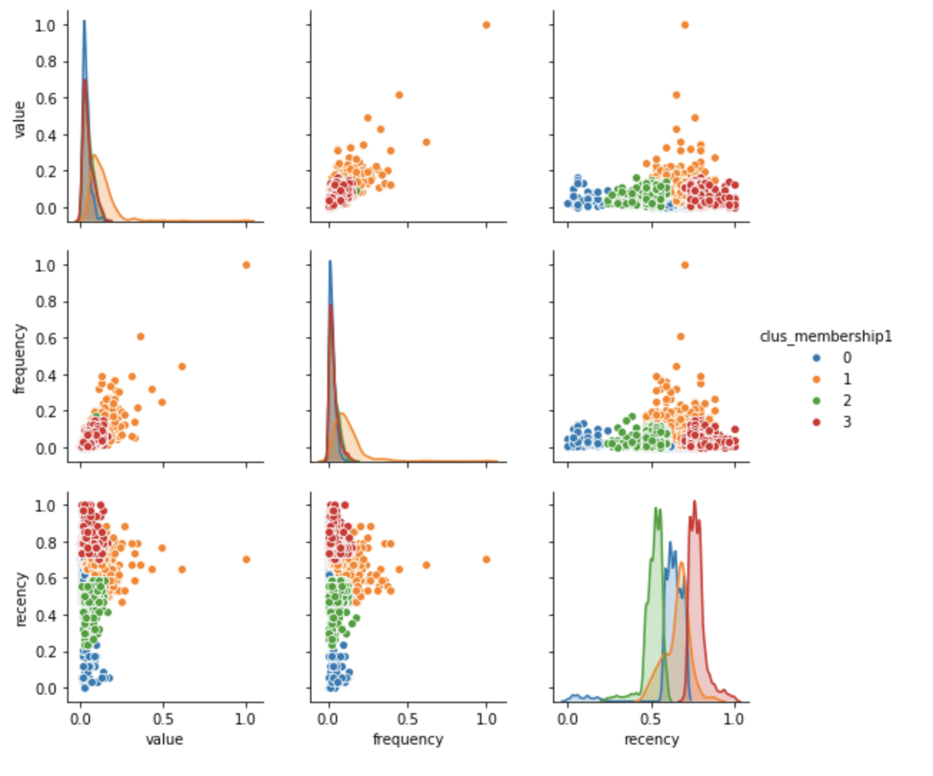
g = sns.pairplot(clustering_df, hue="clus_membership1", diag_kind="kde", vars=["value", "frequency", "recency"])
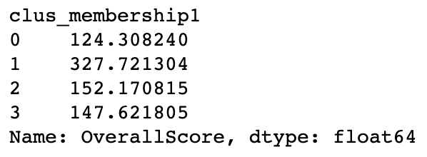
#Paste segment membership to original data for profiling
charity_df['clus_membership1']=model2.labels_

#calculate overall score
#higher is better
charity_df['OverallScore'] = charity_df['value'] + charity_df['frequency'] + charity_df['recency']
charity_df.groupby('clus_membership1')['OverallScore'].mean()

#calculate overall score
#higher is better
charity_df['OverallScore'] = charity_df['value'] + charity_df['frequency'] + charity_df['recency']
charity_df.groupby('clus_membership1')['OverallScore'].mean()

charity_df['Segment'] = '4th'
charity_df.loc[charity_df['clus_membership1']==1,'Segment'] = '1st'
charity_df.loc[charity_df['clus_membership1']==2,'Segment'] = '2nd'
charity_df.loc[charity_df['clus_membership1']==3,'Segment'] = '3rd'
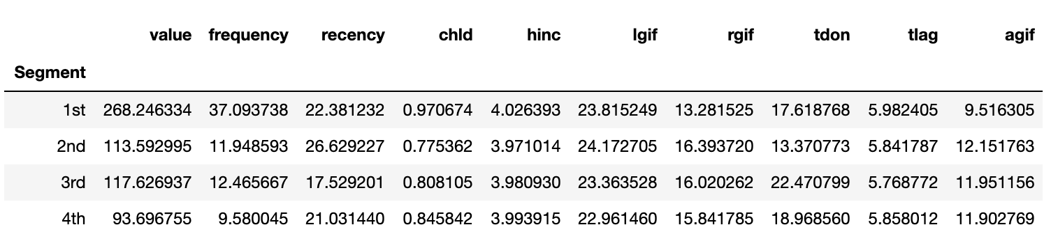
Now, we are ready to prioritize our segments based on the overall importance score. Cluster 1 is the most important followed Cluster 2, Cluster 3 and finally Cluster 0.
We can also profile the established segments based on the original profiling variables. The best segment generated the most revenue with the highest frequency of purchases. However, the second best cluster had more frequent purchases than any other cluster. In fact, the significantly different frequency was the tie breaker between the second and third best segments, since two segments were very similar based on value generated and the frequency of their purchases.
charity_df.groupby('Segment')['value', 'frequency', 'recency', 'chld',
                              'hinc','lgif','rgif', 'tdon', 'tlag', 'agif'].mean()
| Segment | value | frequency | recency | chld | hinc | lgif | rgif | tdon | tlag | agif |
|---|---|---|---|---|---|---|---|---|---|---|
| 1st | 268.246334 | 37.093738 | 22.381232 | 0.970674 | 4.026393 | 23.815249 | 13.281525 | 17.618768 | 5.982405 | 9.516305 |
| 2nd | 268.246334 | 37.093738 | 22.381232 | 0.970674 | 4.026393 | 23.815249 | 13.281525 | 17.618768 | 5.982405 | 9.516305 |
| 3rd | 117.626937 | 12.465667 | 17.529201 | 0.970674 | 4.026393 | 23.815249 | 13.281525 | 17.618768 | 5.982405 | 9.516305 |
| 4th | 93.696755 | 9.580045 | 21.031440 | 0.845842 | 4.026393 | 23.815249 | 13.281525 | 17.618768 | 5.982405 | 9.516305 |