
K-Means Clustering

“‘I didn’t dictate sections of ‘Visions of Cody.’ I typed up a segment of taped conversation with Neal Cassady, or Cody, talking about his early adventures in L.A.”
Introduction:
Clustering (or segmentation in marketing terms) is a group of techniques with a goal of partitioning a dataset into relatively homogenous and distinct subsets. The basis of distinction must be specified by a person knowledgeable about the goal of segmentation.
Segmentation belongs to a group of techniques called unsupervised learning because a target variable is not used during the analytic process. In fact, the goal of the process is to discover structures in the data that separates individuals into subgroups. Several segmentation methods are available. I listed a few of them below, but a more exhaustive list is available by clicking on my introductory blog on clustering techniques: An Introduction to Clustering Techniques. How eloquent…
Partitioning methods;
Hierarchical clustering;
Fuzzy clustering;
Density-based clustering; and
Model-based clustering.
K-means Clustering:
One of the most frequently used partitioning methods is k-means clustering, which is the focus of the current blog. In this type of clustering, we must pre-specify the number of clusters (k). Each observation is then classified into one of k clusters. The clusters must not be overlapping and an observation may not belong to two clusters.
The k-means algorithm seeks to minimize within-cluster variation. The within-cluster variation is the sum of all pairwise squared Euclidean distances in a given cluster. Note that when minimizing within-cluster variation, we are talking about the entire dataset, e.g. we account for all clusters formed. Unfortunately, the problem is not easy to solve because there is a large number of ways we can partition the data (k*n to be precise, where k is the number of clusters and n is the sample size). In order to solve this issue, a process was designed to narrow the number of ways we can partition individual observations.
Determine the preferred number of clusters k.
Randomly assign a number to each observation, where the number is between 1 and the number of segments considered (k).
For each cluster, compute the centroid which is defined by the means of each feature for all observations in a cluster.
Observations then must be assigned to the cluster with the closest centroid based on Euclidean distances. This is a local optimum.
Iterate until segment assignments stabilize, e.g. don’t change.
recency-frequency-monetary value Segmentation
A widely recognized segmentation methodology is Recency-Frequency-Monetary Value where a study population is clustered based on how recently they purchased a product or products, how often they purchased said product(s), and what is the monetary value generated by those sales.
I will apply this methodology to cluster the database of a charity in which data about past donors and potential prospective donors is available. Here, I will follow the following definitions:
Recency: Recency is defined by the number of months passed since a donor’s last donation. During the segmentation project, we will create a composite score using recency, frequency, and value. As a result, we must convert recency to ensure that parallel constructs are being used. One issue is that when considering recency, a smaller number of months is better (obviously!), whereas the other two constructs suggest that the larger their value, the more lucrative a donor is. Since the data contains 40 months of activity, we can convert the recency by subtracting its value from 40. This will be the number of months passed since the inception of the data to the latest donation. This way, a larger value signifies a more attractive donor.
Frequency: Frequency is defined by the number occasions a donor donated at least $1 during the most recent 40 month period. This value was not available, therefore I divided the dollar amount of lifetime gifts to date by the average dollar amount of gifts to date to approximate frequency.
Monetary Value: Monetary value represents the total amount of money donated during the 40 months available.
Analysis of CHARITY DATA:
Loading and Pre-processing Data:
First, we load all necessary modules for k-means clustering.
import numpy as np
import pandas as pd
import matplotlib.pyplot as plt
%matplotlib inline
import xport
import matplotlib.gridspec as gridspec
import sklearn
from sklearn.preprocessing import StandardScaler
import seaborn as sns

from sklearn.cluster import KMeans
from sklearn.preprocessing import LabelEncoder
from sklearn.preprocessing import MinMaxScaler
from sklearn.metrics.pairwise import pairwise_distances_argmin
import os
The second task is to load the data and create the three variables to use for clustering: frequency, recency and monetary value.
charity_df = pd.read_csv('charity.csv') #read csv file
charity_df=charity_df.dropna() #remove all lines with missing observations
I removed all observations, when a person was not a donor. Makes sense, since all three of our segmentation variables stem from the fact that a person donated some money to the charitable organization.
#Select donors only
charity_df=charity_df[charity_df['donr'] == 1]
The feature tdon contains the number of months elapsed since last donation. In order to obtain a practical value for recency, first I looked at the number of months for which data is available. I then subtracted the tdon value from 40 (maximum number of months in data) to get a parallel construct to frequency and monetary value.
### Recency
print(charity_df['tdon'].max())
charity_df['recency']=40-charity_df['tdon']
Next, I created the feature approximating frequency of donation by dividing the dollar amount of lifetime gifts by he average dollar value of gifts.
###### Frequency
#AGIF: Average dollar amount of gifts to date
#TGIF: Dollar amount of lifetime gifts to date

#Create approximate number of donations
charity_df['frequency']=charity_df.tgif/charity_df.agif
No transformation was needed to the monetary value variable: tgif, but I changed the name of the feature from tgif to value.
##### Monetary value
#Total amount donated during the 40-month timeframe
charity_df.rename(columns = {'tgif':'value'}, inplace = True)
Next, I created a new data frame called clustering_df, which was obtained by keeping the three features of interest from the original data frame, charity_df. To reiterate, these features are called recency, frequency and value. See the first five rows below.
#Select variables
clustering_df = charity_df[['recency','frequency', 'value']]
clustering_df.head()

I standardized all values because their values are different in terms of magnitude. There are lots of standardization approaches available. I have written about them earlier in a blog, which can be reached by clicking on Scaling, Centering and Standardization. I forced all values between 0 and 1 by using the MinMax Scaler of sklearn. See the first few rows below.
#STANDARDIZATION #########################
from sklearn.preprocessing import MinMaxScaler
scaler = MinMaxScaler(feature_range=(0,1))

clustering_df=pd.DataFrame(scaler.fit_transform(clustering_df), columns=clustering_df.columns)
clustering_df.head()

Clustering:
Since k-means clustering requires the analyst the specify the number of clusters to form, first we need to figure out what that number would be. A good approach is to use the elbow method, which is a plot of inertia. Note that sometimes the number of clusters is specified by end users such as marketing or sales professionals. Where I work, it is frequently required that we generate four segments. If that is what the boss wants…that is what she gets, right?
Anyway, in this case, it appears that the inertia curve gets linear right around five, therefore I will go with a five cluster solution, e.g. k will be specified as five.
inertia = []
for k in range(1, 10):
    kmeans = KMeans(n_clusters=k, random_state=1).fit(clustering_df)
    inertia.append(np.sqrt(kmeans.inertia_))

plt.plot(range(1, 10), inertia, marker='o');
plt.xlabel('$k$')
plt.ylabel('$J(C_k)$');

We fit the model and make prediction of cluster membership. After our prediction, we can look at the centroid coordinates as well as the cluster membership labels, which we will use in the upcoming steps.
#k-means
kmeans = KMeans(n_clusters=5)
kmeans.fit(clustering_df)
clus_solution = kmeans.predict(clustering_df)

# Get the cluster centroids
print(kmeans.cluster_centers_)

# Get the cluster labels
labels=kmeans.labels_

[[0.53349833 0.03715414 0.04817144]
 [0.66244141 0.03124768 0.04248997]
 [0.64504202 0.16344827 0.1642708 ]
 [0.15484429 0.03907081 0.04954409]
 [0.78348308 0.03660278 0.04754959]]
First, let us see if our clustering results are useful. We hope that there is not one cluster that contains the majority of data, and that there are several reasonably (and equally) large clusters.
Our solution is not too bad, we have three clusters that are about equally large. We also have two smaller segments, and we’ll have to examine what they are or collapse them either mathematically by specifying a different k, or just manually if that is not possible. Or we may just have to live with them as they are.
#Predict and count numbers in each cluster
clus_solution = kmeans.predict(clustering_df)
output = pd.DataFrame(data=clus_solution)
output[0].value_counts(ascending=False)

0    1022
1     891
4     838
2     175
3      68
So let us paste the cluster labels to our original clustering dataset and start assessing our model. First, let’s visualize our model first with a three dimensional scatter plot and then translate the three-dimensional picture to two-dimensional scatter plots.
#paste labels with data
clustering_df['clus_membership']=kmeans.labels_
print(labels)

from mpl_toolkits import mplot3d
%matplotlib inline
import numpy as np
import matplotlib.pyplot as plt

fig = plt.figure(figsize=(8, 8))
ax = fig.add_subplot(111, projection='3d')

# Data for three-dimensional scattered points
zdata = clustering_df['value']
xdata = clustering_df['frequency']
ydata = clustering_df['recency']
ax.scatter3D(xdata, ydata, zdata, s=5, alpha=0.6, c=clustering_df['clus_membership'], cmap='magma');

ax.set_xlabel('Frequency')
ax.set_ylabel('Recency')
ax.set_zlabel('Value')

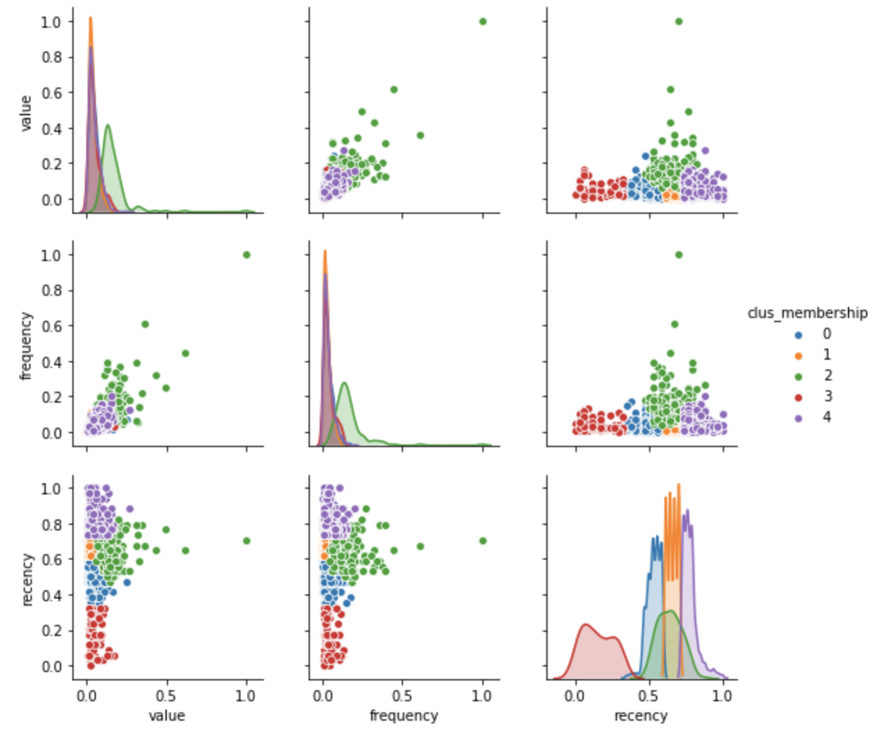
g = sns.pairplot(clustering_df, hue="clus_membership", diag_kind="kde", vars=["value", "frequency", "recency"])
The distribution plots above provide an excellent picture about how differentiated clusters are based on a single feature. For example, Cluster 3 is very well differentiated from the others based on recency, while Cluster 2 is not well differentiated from clusters 0, 1 and 4. This may not be a problem, since our task is multivariate in nature.
Segmentation Assessment:
Let us merge cluster labels with the original data frame (charity_df). We can now create an overall score by adding the values of our three segmentation variables, and prioritize our segments based on this overall value score.
#Paste segment mebership to original data flor profiling
charity_df['clus_membership']=kmeans.labels_

#calculate overall score
#higher is better
charity_df['OverallScore'] = charity_df['value'] + charity_df['frequency'] + charity_df['recency']
charity_df.groupby('clus_membership')['OverallScore'].mean()

clus_membership
0    146.945965
1    138.658677
2    411.366236
3    137.281169
4    154.087292
Name: OverallScore, dtype: float64
Cluster 2 appears to be the most valuable for our charity, followed by Cluster 4, and Cluster 0. Clusters 1 and 3 are the least valuable segments, in that order.
But let us digress for one minute and go back to the question of whether it is OK to have a segment with few individuals in it. Cluster 2 had only a 175 individuals in it. Based on the overall value above, Cluster 2 contains our super supporters. Their overall value is almost four times as large as the next best cluster. So in this case, I would say that it is absolutely OK to have this small segment differentiated from the rest. Cluster 3 had 68 individuals, but that is our lowest value cluster, and we probably would not market to them anyway, so having that segment to be small is also OK.
charity_df['Segment'] = '5th'
charity_df.loc[charity_df['clus_membership']==2,'Segment'] = '1st'
charity_df.loc[charity_df['clus_membership']==4,'Segment'] = '2nd'
charity_df.loc[charity_df['clus_membership']==0,'Segment'] = '3rd'
charity_df.loc[charity_df['clus_membership']==1,'Segment'] = '4th'
We can now use our original data to describe our segments and see if any of that makes sense.
charity_df.groupby('Segment')['value', 'frequency', 'recency', 'chld','hinc','lgif','rgif', 'tdon', 'tlag', 'agif'].mean()

Now that we calculated the group means by segment, we can see that our first segment is the most valuable donating far more money than any other group. Individuals in this cluster also donate frequently but they are not the most recent donors on average. The 2nd, 3rd and 5th best segments are not differentiated in terms of the amount donated or the frequency of their donation but the 2nd best cluster generally contains the most recent donors. Individuals in the 5th cluster have not donated recently, and their lapsed behavior is severe. In contrast, people in the 4th best cluster have donated recently, but the overall value of their donations is very low.
