Manatee Data: General Linear Models
“Manatee deaths in Florida by watercraft hit a new record, officials say”
A record number of manatee deaths caused by boats begs the question: would limiting the number of boats solve the problem?
I have been reading about the record number of manatee deaths caused by watercraft in Florida. The first half of 2019 set a record, and the while year of 2018 also surpassed the death toll of any other year. Since I wanted to demonstrate the basics of regression, I figured I get some data about boats and manatees and see whether certain actions would help with the problem. So on this page, we will look at how to find the y intercept and the slope of a regression line. We will also test assumptions of regression to see if the model we built is a good fit using residuals. Finally, we will calculate the coefficient of determination and test the significance of the slope and of the entire model. Sounds good?
Let me also disclose that I obtained data from the Florida Fish and Wildlife Conservation Commission about manatee mortality statistics:
https://myfwc.com/research/manatee/rescue-mortality-response/statistics/mortality/yearly/
I also downloaded some statistics about boat ownership in the state of Florida from the Department of Highway Safety and Motor Vehicles (FLHSMV):
https://www.flhsmv.gov/motor-vehicles-tags-titles/vessels/vessel-owner-statistics/
Lucky for us, everyone who owns a boat with an EPIRB (Emergency Position Indicating Radio Beacon) must register it with the FLHSMV. Boats are then classified based on their size. The following shows the classification and corresponding boat sizes that appear in the data below. Notice, that I entered frequency counts for each year between 2000-2017 by boat class. The classification is courtesy of FLHSMV (I took it as written on the website.)
Class A-1: Less than 12 feet
Class A-2: 12 to less than 16 feet
Class1: 16 to less than 26 feet
Class2: 26 to less than 40 feet
Class3: 40 to less than 65 feet
Class4: 65 to less than 110 feet
Class5: 110 or more in length
For each of the seven categories, FLHSMV distinguishes between commercial vessels and vessels for pleasure, which I indicated as either as p (pleasure) or c (commercial) in the code.
I created an analytical dataset:
Since the data I downloaded was disparate, I had to do a bit of data prep. First, I created several lists. I simply typed the data into several lists. Some a bit of a time but hey, I wanted to get some real data and as far as I could tell only pdf version were available year by year. With each list populated, I created a list of lists. I then created a Pandas data frame from the list of lists, transposed it and gave names to each of the columns:
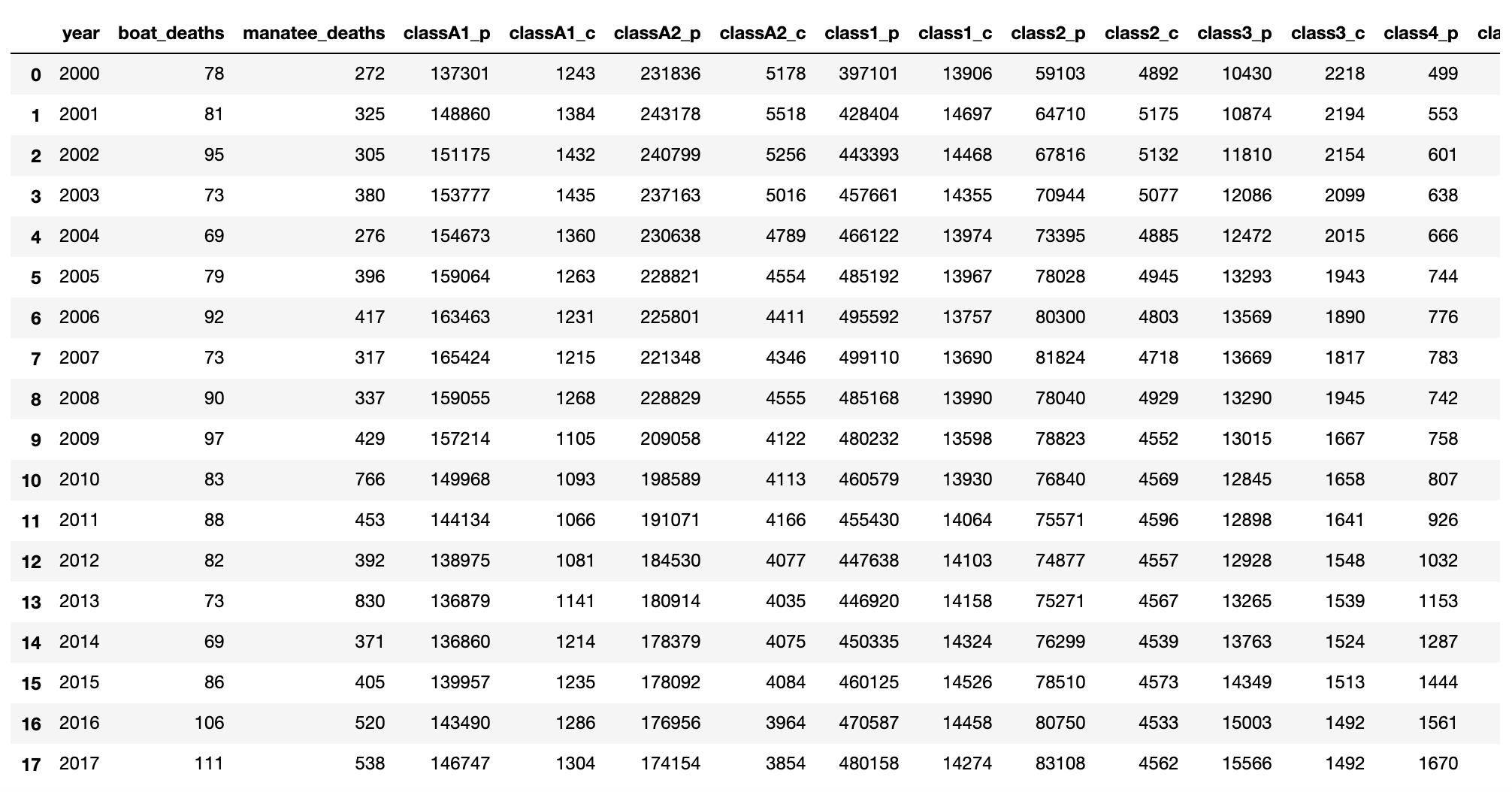
# CREATE LISTS
year=[2000,2001,2002,2003,2004,2005,2006, 2007, 2008, 2009, 2010, 2011, 2012, 2013, 2014, 2015, 2016, 2017]
boat_deaths=[78,81,95,73,69,79,92,73,90,97,83,88,82,73,69,86,106,111]
manatee_deaths=[272, 325, 305, 380, 276, 396, 417, 317, 337, 429, 766, 453, 392, 830, 371, 405, 520, 538]

#Number of vessels by class
#Only vessels equipped with an EPIRB (Emergency Position, Indicationg Radio Becon) considered by class
#p indicates pleasure and c indicates commercial

classA1_p=[137301,148860,151175, 153777,154673, 159064,163463, 165424, 159055, 157214, 149968,144134,138975,136879,136860,139957,143490,146747]
classA1_c=[1243, 1384, 1432, 1435,1360,1263,1231,1215, 1268, 1105, 1093, 1066, 1081,1141,1214,1235,1286,1304]
classA2_p=[231836,243178,240799,237163,230638,228821,225801, 221348, 228829, 209058,198589, 191071, 184530,180914,178379,178092,176956,174154]
classA2_c=[5178,5518,5256, 5016,4789, 4554, 4411, 4346, 4555, 4122, 4113, 4166, 4077,4035,4075,4084,3964,3854]
class1_p=[397101,428404,443393, 457661,466122,485192, 495592, 499110, 485168, 480232,460579, 455430, 447638,446920,450335,460125,470587,480158]
class1_c=[13906, 14697,14468, 14355,13974,13967,13757, 13690, 13990, 13598,13930, 14064,14103, 14158,14324,14526,14458,14274]
class2_p=[59103, 64710,67816, 70944,73395,78028,80300, 81824, 78040, 78823, 76840, 75571, 74877,75271,76299,78510,80750,83108]
class2_c=[4892, 5175, 5132, 5077, 4885,4945, 4803, 4718, 4929, 4552, 4569, 4596, 4557,4567,4539,4573,4533,4562]
class3_p=[10430,10874,11810, 12086,12472,13293,13569, 13669, 13290, 13015, 12845, 12898, 12928,13265,13763,14349,15003,15566]
class3_c=[2218,2194,2154, 2099,2015, 1943,1890, 1817, 1945,1667, 1658, 1641, 1548,1539,1524,1513,1492,1492]
class4_p=[499,553,601, 638, 666,744,776, 783, 742, 758, 807, 926, 1032,1153,1287,1444,1561,1670]
class4_c=[494,514, 507, 483, 463,455,417, 386,  454, 349, 329, 299, 290,271,270,263,250,255]
class5_p=[43,40,43, 42,58,68,75, 91, 67, 58, 59,58,63,75,92,117,115,131]
class5_c=[25, 31, 35, 32,29,27,33, 33, 27, 30,27,81, 77,77,84,84,82,82]

# CREATE A LIST OF LISTS
manatee_data=[year, boat_deaths, manatee_deaths, classA1_p, classA1_c, classA2_p, classA2_c, class1_p, class1_c, class2_p, class2_c, class3_p, class3_c, class4_p, class4_c, class5_p, class5_c]
print(manatee_data)

# Create a data rame using Pandas
# FIRST IMPORT PANDAS
import pandas as pd
manatee_data_df = pd.DataFrame(manatee_data)
#TRANSPOSE DATAFRAME
manatee_data_df = manatee_data_df.T
#NAME COLUMNS
manatee_data_df.columns = ['year', 'boat_deaths', 'manatee_deaths', 'classA1_p', 'classA1_c', 'classA2_p',
                     'classA2_c', 'class1_p', 'class1_c', 'class2_p', 'class2_c', 'class3_p', 'class3_c',
                     'class4_p', 'class4_c', 'class5_p', 'class5_c']
manatee_data_df
We are ready for regression analysis:
Now that we have a dataset, we can start our regression analysis. In this section, we will estimate the intercept and the slope. We will compute the Coefficient of Determination (aka r squared). We will then test the significance of the slope and the model itself.
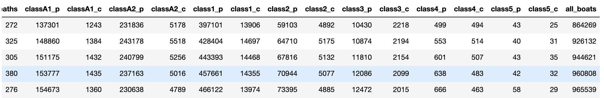
Since we are discussing simple linear regression, I added the various boat class frequencies into a single total for each row. So, we will now try estimate how the number of boats each year relate to the number of boat related manatee deaths. At this point, I’d think that the more boats we have, the more manatees get killed. Of course it is also possible that other factors, such as drunk boating, careless boating, higher speeds, more powerful engines….or who knows what else….impact manatee populations, but that is a different study for a different day. In any case, here is our data, although I took a picture of the first few rows and first few columns. (Since this is a screen shot, I am only showing the right part of the table., which now as the all_boats variable)
#ADD ALL BOAT TYPES AND CREATE A SINGLE VALUE
manatee_data_df['all_boats']=manatee_data_df['classA1_p']+manatee_data_df['classA1_c']+manatee_data_df['classA2_p']+manatee_data_df['classA2_c']+manatee_data_df['class1_p']+manatee_data_df['class1_c']+manatee_data_df['class2_p']+manatee_data_df['class2_c']+manatee_data_df['class3_p']+manatee_data_df['class3_c']+manatee_data_df['class4_p']+manatee_data_df['class4_c']+manatee_data_df['class5_p']+manatee_data_df['class5_c']
manatee_data_df.head(5)
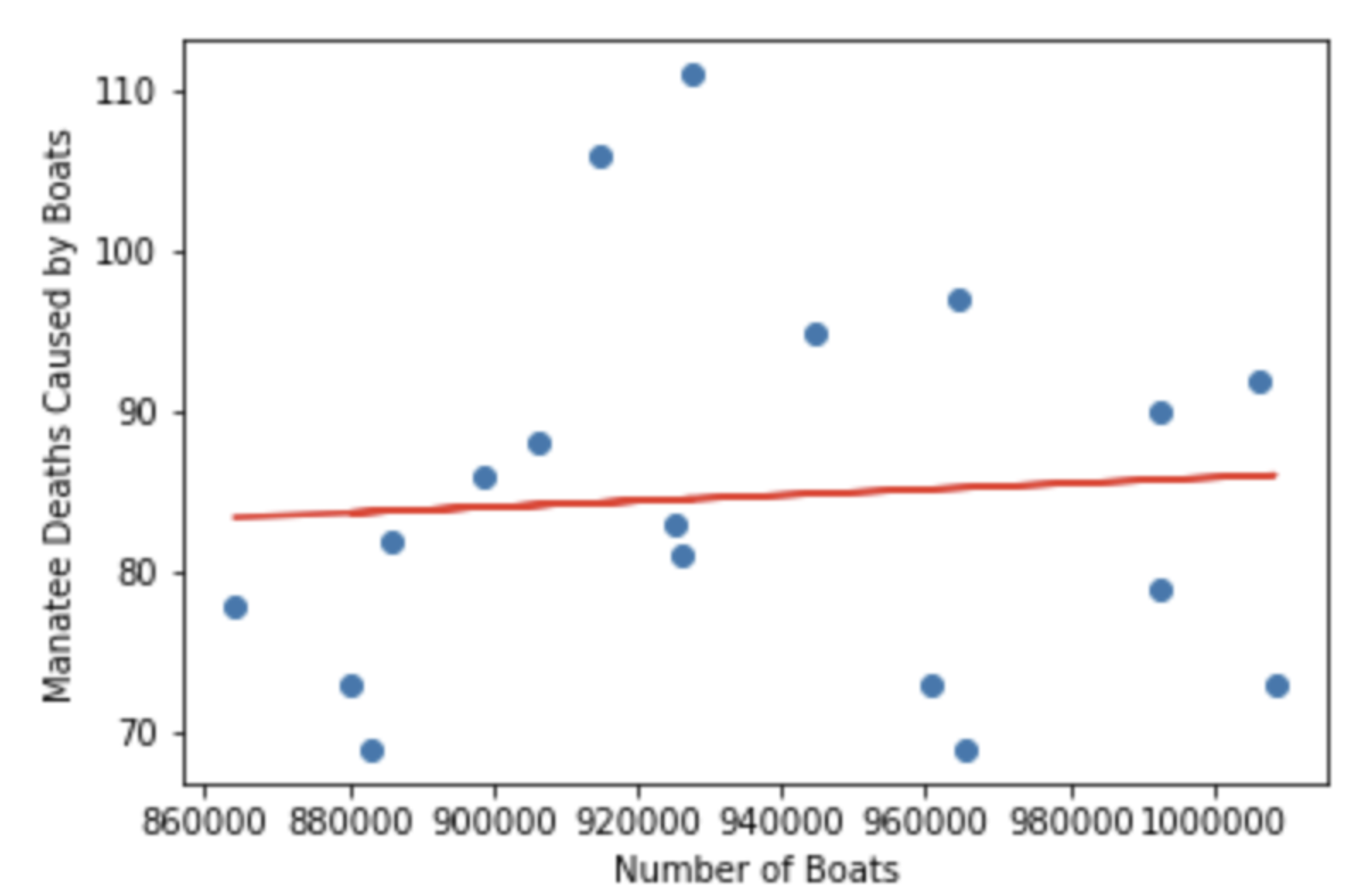
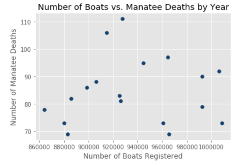
# VISUALIZE THE DATA
import matplotlib.pyplot as plt
from matplotlib import style
style.use('ggplot')
plt.scatter(manatee_data_df.all_boats, manatee_data_df.boat_deaths, color='#003F72')
plt.title('Number of Boats vs. Manatee Deaths by Year')
plt.xlabel('Number of Boats Registered')
plt.ylabel('Number of Manatee Deaths')
plt.show()
In this visualization, I used a scatter plot with the number of deaths on the y axis and the number of boats on the x axis. Each dot represent an observation for a year.
A scatter plot should imply a bivariate relationship between the two variables by producing a shape. In our case, it is hard to imagine what the relationship between boat related manatee deaths and the number of boats may look like. Looking at our plot is already making me concerned, because there appears to be no shape to this, and no shape usually means no relationship.
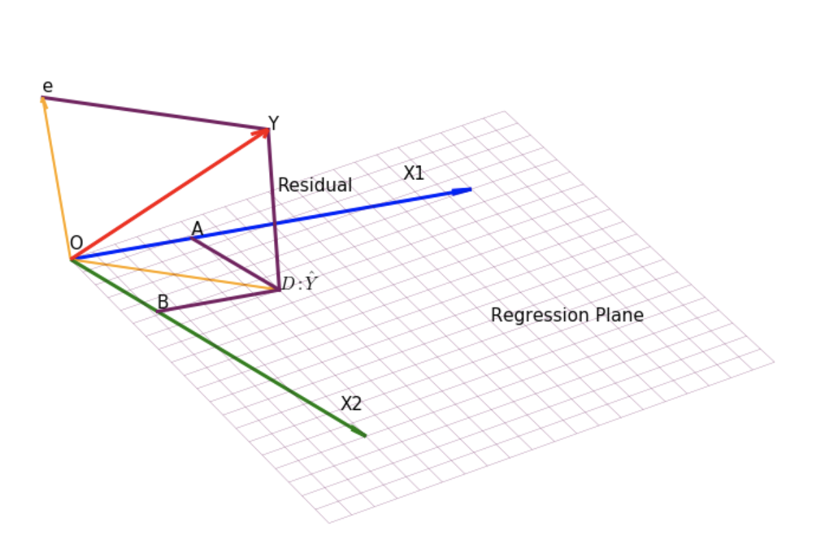
Regression analysis is the construction of a mathematical model that allows us to predict one variable based on another variable(s). In simple regression, we only have two variables, one that is called an independent variable or predictor, and another called dependent variable or response variable. In other words, in a simple linear regression, a single regressor x has a relationship with a response y. A fancier depiction would be:

The parameters beta 0 and beta 1 are called regression coefficients, where beta 1 is the change in mean of the distribution y when we change x by one unit, and beta 0 is the y intercept.
Let’s proceed with our regression analysis and estimate the slope and intercept. The formulas we will be executing in Python are as follows:
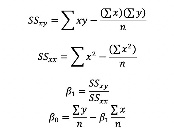
In the code below, I computed the square of each Y and the square of each X observation. I also computed the product of X*Y. I then saved all into three different columns respectively as part of the manatee_data_df data frame. You can of course execute this without creating the extra columns in a single formula in the next step.
Next, I found the sum of X sum of Y sum of X*Y, sum of X squared. I also computed the sample size n. In the case of the manatee data, n is obvious, but most of the time we have thousands or millions of observations, and len() is the only way.
#CALCULATE X*Yfor each observation
#CALCULATE Y Squared for each observation
#Caluclate X Squared for each observation
manatee_data_df['X*Y']=manatee_data_df['boat_deaths']*manatee_data_df['all_boats']
manatee_data_df['Xsquared']=manatee_data_df['all_boats']**2
manatee_data_df['Ysquared']=manatee_data_df['boat_deaths']**2

# CALCULATE THE SUM OF Y (MANATEE DEATHS) OBSERVATIONS
# CALCULATE THE SUM OF X (ALL BOATS) OBSERVATIONS
# CALCULATE THE SUM OF X*Y
# CALCULATE THE SUM OF Y SQUARED
# CALCULATE THE SUM OF X SQURED
sum_Y=manatee_data_df.boat_deaths.sum()
sum_X=manatee_data_df.all_boats.sum()
sum_xy=manatee_data_df['X*Y'].sum()
sum_xsquared=manatee_data_df['Xsquared'].sum()
sum_ysquared=manatee_data_df['Ysquared'].sum()
n=len(manatee_data_df.year)
print(sum_Y, sum_X, sum_xy, sum_xsquared, sum_ysquared, n)

1525 16846494 1427922614 15802409544614 131703 18
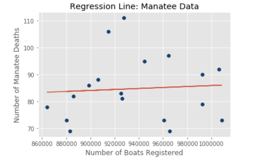
Now that we established all components needed, we are ready to compute the slope and intercept. The slope is 0.000018315316915543, which is essentially 0 and the intercept is 67.58. A zero slope is just a horizontal line indicating no relationship between boat related manatee deaths and the number of registered boats.
#CALCULATE THE SLOPE
#SSxy
SSxy=sum_xy-(sum_X*sum_Y)/n
#SSxx
SSxx=sum_xsquared-(sum_X)**2/n
slope=SSxy/SSxx
# CALCULATE THE INTERCEPT
y_intercept=sum_Y/n-slope*sum_X/n
y_intercept
print(SSxx, SSxy, slope, y_intercept)

35500650612.0 650205.6666667461 1.8315316915543016e-05 67.58061797078923
So, what we found here is that the number of boats impacts the number of boat related manatee deaths only slightly (we have not yet talked about significance!). One can see this from the visualization of our regression line. below With the current registered boat population of about a million boats, one can expect about 85 boat related manatee deaths per year.
So did we create a good model?
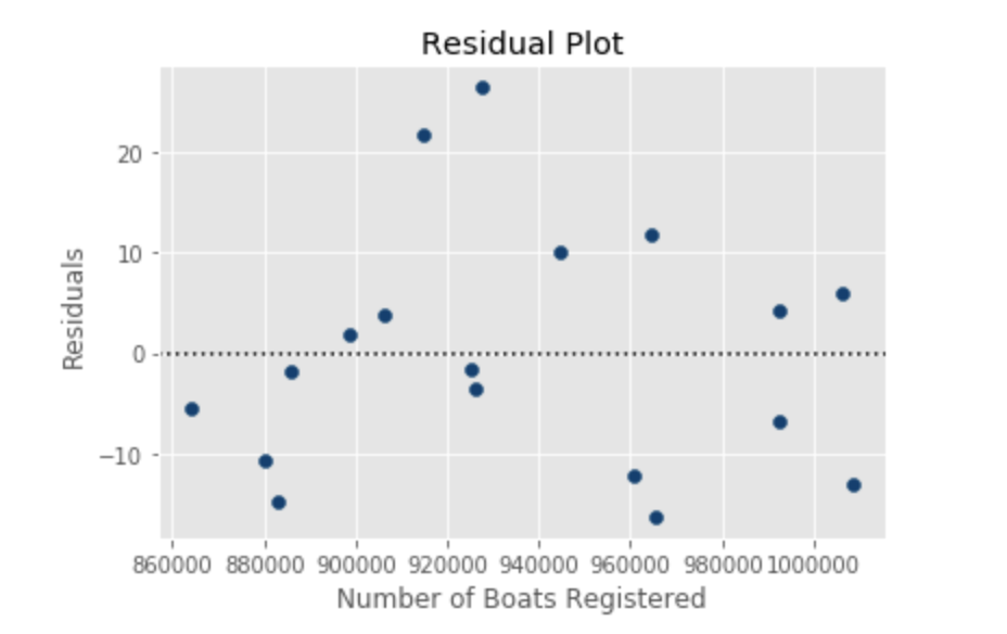
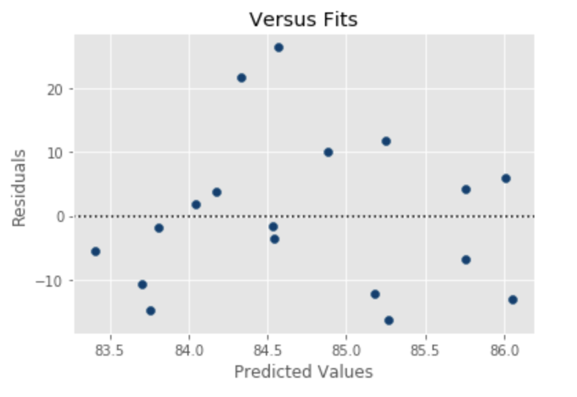
Now that we have the prediction, we should start thinking about whether this is a good model. A good way of accomplishing this through residual analysis. Residual analysis is set out to determine if the regression line we just created is a good fit of the data. One approach is to use historical data as X values, make predictions of Y and then compare those values with the actual values of Y. The difference between each predicted and actual Y pair is called a residual. Residuals represent prediction error and a good model would produce less error, which would mean smaller residuals.
#ANALYSIS OF RESIDUALS
#DEPLOY MODEL ON HISTORIC X OBSERVATIONS
print(slope, y_intercept)
manatee_data_df['Predicted']=y_intercept+slope*manatee_data_df['all_boats']

# COMPUTE FRESIDUALS
manatee_data_df['residuals']=manatee_data_df['boat_deaths']-manatee_data_df['Predicted']
# RESIDUAL PLOT
plt.axhline(y=0, color='k', linestyle=':') #draw a black horizontal line when residuals equal 0
plt.scatter(manatee_data_df.all_boats, manatee_data_df.residuals, color='#003F72')
plt.title('Residual Plot')
plt.xlabel('Number of Boats Registered')
plt.ylabel('Residuals')
plt.show()

1.8315316915543016e-05 67.58061797078923
In our case, residuals don’t congregate around the “no error” line. Since our sample size is very small, that is a problem. One would hope to find lots of observations around the 0 residual line at 0.
Outliers and influential observations:
Residuals can also be useful to detect outliers, e.g. data points that are very different than other values. These residuals will be far from the rest of the points. What is far? Note that the sum of residuals is always zero. In fact, the regression line represents the geometrical middle of all points. In this case, we can plot residuals against the x-axis to see how residuals behave as x changes.
Indeed, we can see that our model made the worst prediction of the 17 predictions, when the X value was about 930,000. We will talk about what to do about this issue in a later section. For now, let’s move on…
Residuals can be used to test the assumptions of regression:
Residuals are often used to check if the assumptions of regression are maintained. Simple regression has four main assumptions, which can be tested using residuals.
1. The model must be linear
2. The error terms have constant variances (homoscedasticity)
3. The error terms should be independent
4. The error terms must be normally distributed
The residual plots should be used with caution when the sample sizes are low (like in the current case), but generally are very good tools to check for regression assumptions.
#RESIDUALS VS. FITS
plt.axhline(y=0, color='k', linestyle=':') #draw a black horizontal line when residuals equal 0

plt.scatter(manatee_data_df.Predicted, manatee_data_df.residuals, color='#003F72')
plt.title('Versus Fits')
plt.xlabel('Predicted Values')
plt.ylabel('Residuals')
plt.show()
Since there are few observations here, it is really difficult to decipher whether the data is heteroscedastic or homoscedastic. Normally, heteroscedasticity (a violation of regression assumption that the variance of error terms is constant) is depicted by a fan shaped pattern where the observations fan out as X gets larger.
import numpy as np
import numpy.random as random
import pandas as pd
import matplotlib.pyplot as plt
%matplotlib inline

data=manatee_data_df['residuals'].values.flatten()
data.sort()
norm=random.normal(0,2,len(data))
norm.sort()
plt.figure(figsize=(12,8),facecolor='1.0')
plt.plot(norm,data,"o")

#generate a trend line as in http://widu.tumblr.com/post/43624347354/matplotlib-trendline
z = np.polyfit(norm,data, 1)
p = np.poly1d(z)
plt.plot(norm,p(norm),"k--", linewidth=2)
plt.title("Normal Q-Q plot", size=16)
plt.xlabel("Theoretical quantiles", size=12)
plt.ylabel("Expreimental quantiles", size=12)
plt.tick_params(labelsize=12)
plt.show()
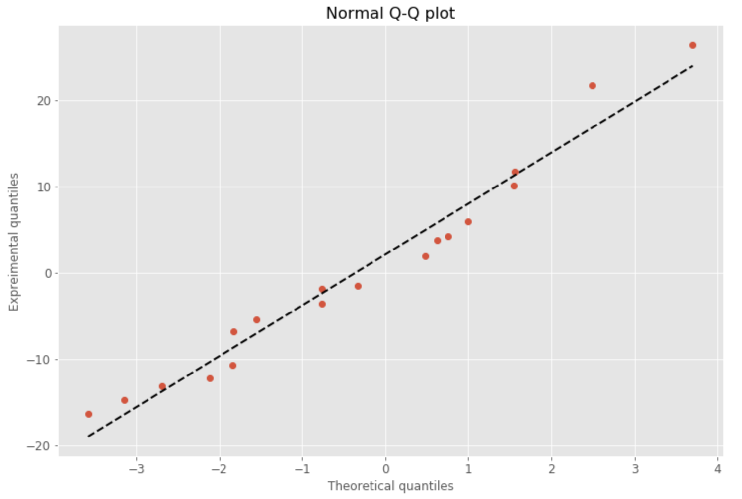
Again, the few observations make it difficult to assess the normal probability plot and whether the residuals are normally distributed. A straight line of the Normal Probability Plot (Q-Q Plot sometimes) would certainly indicate that the residuals are normally distributed. However, the manatee data plot shows a deviation from normal …
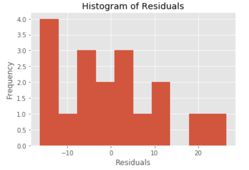
Indeed, the histogram of residuals confirm my fear. It appears that the histogram does not show a normal distribution, although we plotted only 17 observations. A histogram groups residuals into classes, so we do not have to rely completely on the normal probability plot. I don’t like the spike on the left of the residual histogram. There is a skew towards the larger negative values.
#HISTOGRAM OF RESIDUALS

import matplotlib.pyplot as plt
import numpy as np
import pandas as pd
x = manatee_data_df['residuals']

plt.title('Histogram of Residuals')
plt.hist(x, bins=10)
plt.ylabel('Frequency')
plt.xlabel('Residuals')
plt.show()
Standard error of the estimate:
Sum of Squares Error is the sum of the residuals squared. The target of our current form of regression is to minimize SSE, hence the name least squares regression. There are two ways to calculate the SSE. I used the computational formula. I also added the formula for the standard error of the estimate (Se), which is the standard deviation of the error of the regression model.
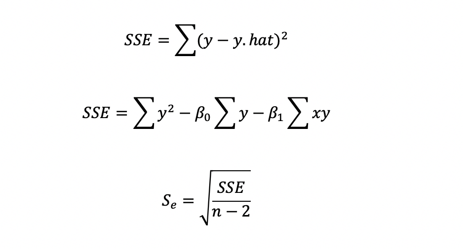
## STANDARD ERROR OF ESTIMATE
#COMPUTE SUM OF SQUARES ERROR
manatee_data_df['Y-YHAT']=manatee_data_df['boat_deaths']-manatee_data_df['Predicted']
manatee_data_df['Y-YHAT**2']=(manatee_data_df['Y-YHAT'])**2
SSE=manatee_data_df['Y-YHAT**2'].sum()
SSE

# STANDARD ERROR OF ESTIMATE
import math
num=SSE/(n-2)
Se=math.sqrt(num)
print(Se, manatee_data_df['residuals'])

12.474229405723403 0     -5.409979
1     -3.543019
2     10.118349
3    -12.178121
4    -16.264771
5     -6.756079
6      5.992012
7    -13.050773
8      4.244012
9     11.752775
10    -1.529722
11     3.825687
12    -1.803886
13   -10.702950
14   -14.753867
15     1.956256
16    21.669530
17    26.434545
Name: residuals, dtype: float64
In our case, the standard error of the estimate is 12.47. But how is this helpful? We have an empirical rule that data that is normally distributed should have about 68% of its observations within one standard deviation around the mean (in both directions). Also, 95% of cases should be within two standard deviations around the mean. One of the requirements of regression is that the error terms should be normally distributed and their average must be zero. The manatee data’s outcome variable ranges between 69 and 111 and standard deviation of error is 12.47. Therefore 68% of all error observations should be within 12.47 and 95% of error observations should be within 24.94. In reality five of 17 errors were outside of one standard deviation and one of 17 was outside of two standard deviations. Not a particularly strong performance.
Coefficient of determination:
Everyone looks at the coefficient of determination or r-squared. It represents the proportion of variability that the dependent variable (boat induced manatee deaths in our case) account for by the regressor (the number of boats in our case). R-squared ranges between 0 and 1 with 0 having accounted for none of the variability and 1 having perfect predictive ability.

# COEFFICIENT OF DETERMINATION
print(SSE,sum_ysquared,sum_Y,n)
r2=1-(SSE/(sum_ysquared-sum_Y**2/n))
r2

2489.702388265831 131703 1525 18
0.004760421311044372
The coefficient of determination was 0.004 in the manatee regression example, which is very close to zero. This means that our predictor, e.g. the number of boats, has virtually no explanatory power of boat related manatee deaths.
Testing the slope and the overall significance of the model is important:
While it is very clear so far that our predictor does not serve well in prediction and our model is actually a poor one in terms of fit, we might as well look at testing the slope and overall model significance, just to learn how to do it.
When we are testing the slope, we are technically asking the following: Now that we created a sample slope of a model, we want to test if the population slope is different from zero. If we had access to the x and y pairs in the population, would the slope of that regression differ from zero?
H0: b1 = 0 Ha: b1 Z 0
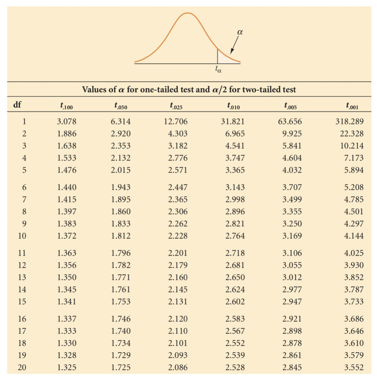
We will run a two-tailed test and reject the null hypothesis if the slope is either negative or positive, e.g. it is not zero. We will conduct a t-test of the slope.
The t value we obtained is 0.28. The critical value of t when alpha is 0.05 is 2.131, which can be found in a t-table (two-tails). Our t-value is significantly lower, therefore we can conclude that the slope is not significant Not rejecting the null hypothesis means that the population slope is zero and the regression model does not add to the explanation of the outcome variable and the model has no predictability.
# TEST THE SLOPE
print(Se,SSxx, slope)
Sb=Se/SSxx**0.5
t=slope/Sb
print(t)

#Go to significance table
#assume two-tailed test and alpha/2=0.25 (95% confidence interval)
#The number is significantly larger therefore we reach statistical sigificance

12.474229405723403 35500650612.0 1.8315316915543016e-05
0.2766424787895347
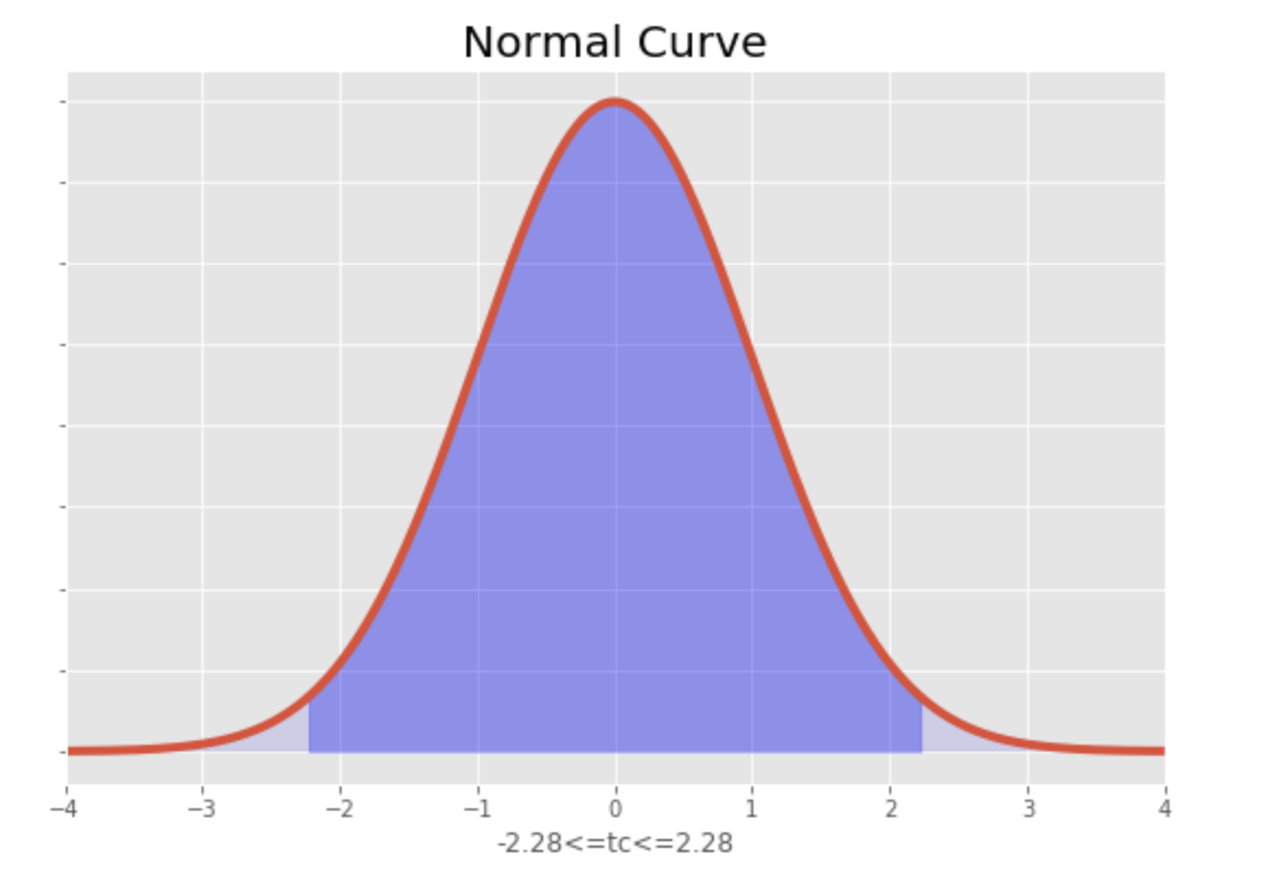
#VISUALIZE
import numpy as np
import matplotlib.pyplot as plt
from scipy.stats import norm
%matplotlib inline

#define constraints
mu=0
sigma=1
x1=-2.228
x2=2.228

#calculate z-transform
z1=(x1-mu)/sigma
z2=(x2-mu)/sigma
x=np.arange(z1,z2, 0.001)  #range of x
x_all=np.arange(-10,10,0.001)
y=norm.pdf(x,0,1)
y2=norm.pdf(x_all,0,1)

#Create plot
fig, ax=plt.subplots(figsize=(9,6))
plt.style.use('fivethirtyeight')
ax.plot(x_all,y2)
ax.fill_between(x,y,0, alpha=0.3, color='b')
ax.fill_between(x_all,y2,0, alpha=0.1, color='b')
ax.set_xlim(-4,4)
ax.set_xlabel('-2.28<=tc<=2.28')
ax.set_yticklabels([])
ax.set_title('Normal Curve')
plt
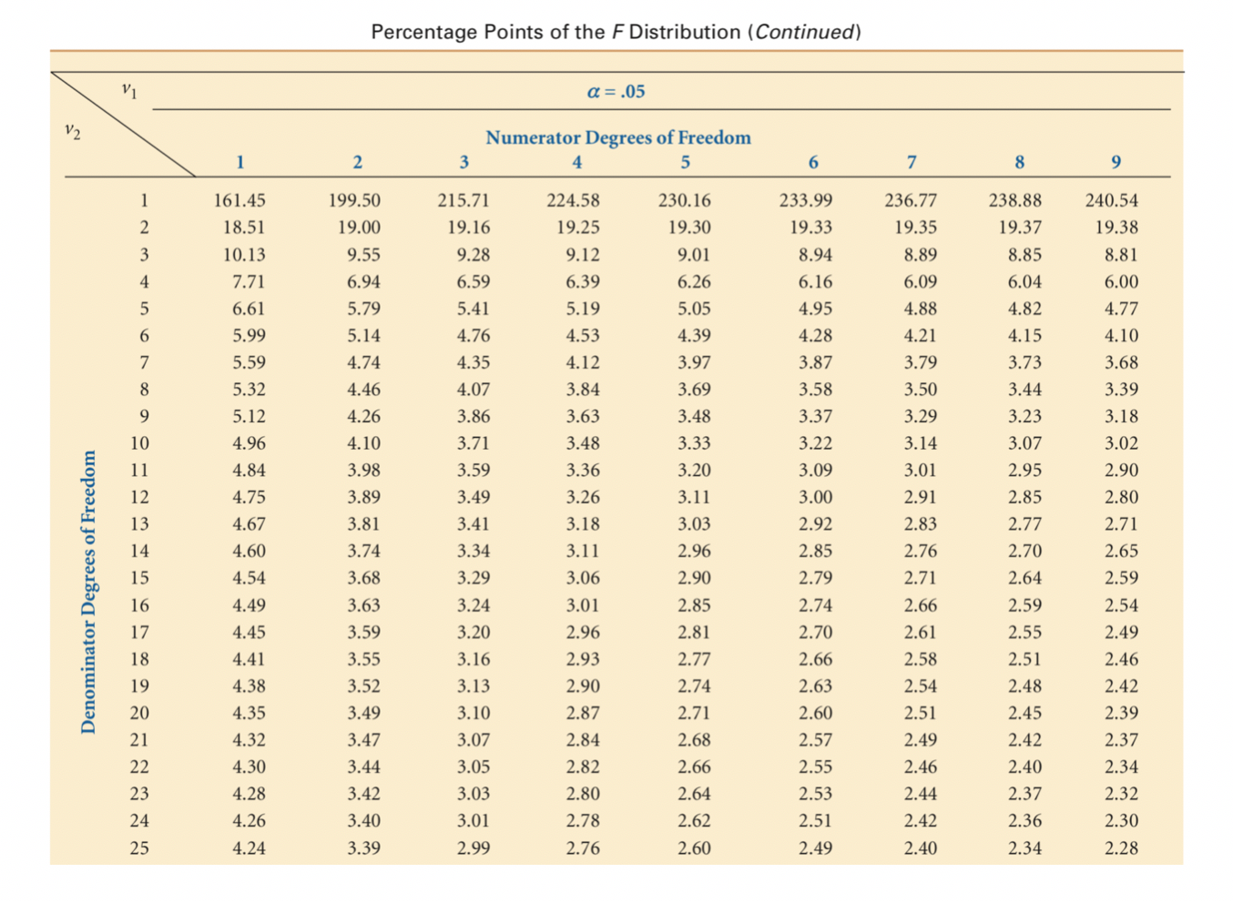
Now let us test the overall model. The test of the overall model requires the use of an F test. Since we are using simple regression, the model test is the same as the test of the slope. In multiple regression, we would be testing if at least one of the regressor coefficients is different from zero. So, while this is redundant, I will still run the code. Indeed, the F test also shows that the model is not significant.
# TEST MODEL SIGNIFICANCE
print(t)
F=t**2
F
#Go to ANOVA table

0.2766424787895347
0.07653106107081815
Final thoughts:
So we did the analysis, now what? We now know that the relationship between the number of boats licensed to operate in Florida and the number of manatee deaths is not significant. First, we must be clear about what we researched. It is entirely possible tat something about boating is a significant danger to manatees. We can only say that the number of boats is not a significant predictor of manatee deaths.
We also have to be honest about our study. We do have very few observations, since we were looking at yearly data. Could we generate more data for a more robust analysis? We definitely should try! We could also look into different/additional variables or disassemble the number variable into categories of watercraft. But for now, we know what regression is about!