OLS Regression: Boston Housing Dataset

In this section I wanted to demonstrate how to fit a multiple regression model using the Scikit-learn library in Python. Scikit-learn allows us to fit many different supervised and unsupervised models, but here I focused on fitting a linear regression model. The linear regression model is housed in the linear_model module of sklearn, which is Python’s Scikit-learn library.
When fitting linear models, we must be diligent with respect to discovering and fixing issues that frequently occur in real world data. Patterns in data frequently result in violations of regression assumptions:
1. Non-linear relationships between regressors and the response;
2. Correlation of error terms;
3. Non-constant variance of error terms or heteroscedasticity;
4. Presence of outliers;
5. Presence of influential observations or high-leverage points; and
6. Multicollinearity.
In this section, I wanted show how to diagnose these issues, and solutions to them are offered in subsequent posts.Several datasets are available from sklearn. I will work through the Boston Housing dataset in this example. It is available in sklearn as a toy dataset. Upon loading the dataset, we can see that it has 506 rows and 13 columns.
import pandas as pd
from sklearn.datasets import load_boston
boston= load_boston()
print(boston.data.shape)
print(boston.DESCR)
A description of the dataset including a data dictionary is available. It is a rather old dataset, but it is perfect for regression analysis demonstration because it is loaded with violations of regression assumptions.
. _boston_dataset:
Boston house prices dataset
---------------------------
**Data Set Characteristics:**
    :Number of Instances: 506
    :Number of Attributes: 13 numeric/categorical predictive. Median Value (attribute 14) is usually the target.
    :Attribute Information (in order):
        - CRIM     per capita crime rate by town
        - ZN       proportion of residential land zoned for lots over 25,000 sq.ft.
        - INDUS    proportion of non-retail business acres per town
        - CHAS     Charles River dummy variable (= 1 if tract bounds river; 0 otherwise)
        - NOX      nitric oxides concentration (parts per 10 million)
        - RM       average number of rooms per dwelling
        - AGE      proportion of owner-occupied units built prior to 1940
        - DIS      weighted distances to five Boston employment centres
        - RAD      index of accessibility to radial highways
        - TAX      full-value property-tax rate per $10,000
        - PTRATIO  pupil-teacher ratio by town
        - B        1000(Bk - 0.63)^2 where Bk is the proportion of blacks by town
        - LSTAT    % lower status of the population
        - MEDV     Median value of owner-occupied homes in $1000's
    :Missing Attribute Values: None
    :Creator: Harrison, D. and Rubinfeld, D.L.
This is a copy of UCI ML housing dataset.
https://archive.ics.uci.edu/ml/machine-learning-databases/housing/
First, I created two data frames, one containing all regressors and one for the target variable.
#Create analytical data set
#Create dataframe from feature_names
boston_features_df = pd.DataFrame(data=boston.data,columns=boston.feature_names)

#Create dataframe from target
boston_target_df = pd.DataFrame(data=boston.target,columns=['MEDV'])
print(boston_target_df.head())
print(boston_features_df.head()
 MEDV
0  24.0
1  21.6
2  34.7
3  33.4
4  36.2
      CRIM    ZN  INDUS  CHAS    NOX     RM   AGE     DIS  RAD    TAX
0  0.00632  18.0   2.31   0.0  0.538  6.575  65.2  4.0900  1.0  296.0
1  0.02731   0.0   7.07   0.0  0.469  6.421  78.9  4.9671  2.0  242.0
2  0.02729   0.0   7.07   0.0  0.469  7.185  61.1  4.9671  2.0  242.0
3  0.03237   0.0   2.18   0.0  0.458  6.998  45.8  6.0622  3.0  222.0
4  0.06905   0.0   2.18   0.0  0.458  7.147  54.2  6.0622  3.0  222.0
   PTRATIO       B  LSTAT
0     15.3  396.90   4.98
1     17.8  396.90   9.14
2     17.8  392.83   4.03
3     18.7  394.63   2.94
4     18.7  396.90   5.33
I concatenated the two data frames and called the data frame boston_df. It now contains all regressors and target variable. We are now ready for Exploratory Data Analysis!
#create a single data frame with both features and target by concatonating
boston_df=pd.concat([boston_features_df, boston_target_df], axis=1)
boston_df.head()

Exploratory Data Analysis:
It is tempting to skip Exploratory Data Analysis. However, EDA allows us to understand the data, and it allows us to discover issues that may effect the results of statistical models.
Distribution of Variables:
We can start by looking at the distribution of our data. The target (MEDV) looks fairly normal although there is a skew on the right, which could cause problems.
#Exploratory Data Analysis
import matplotlib.pyplot as plt
plt.style.use('ggplot')
# Histogram of target: MEDV
boston_df['MEDV'].plot(kind='hist',edgecolor='black',figsize=(6,3))
plt.title('Median value of owner-occupied homes in $1000s', size=15)
plt.xlabel('Value', size=15)
plt.ylabel('Frequency', size=15)
plt.tight_layout(pad=0.4, w_pad=0.5, h_pad=1.0)

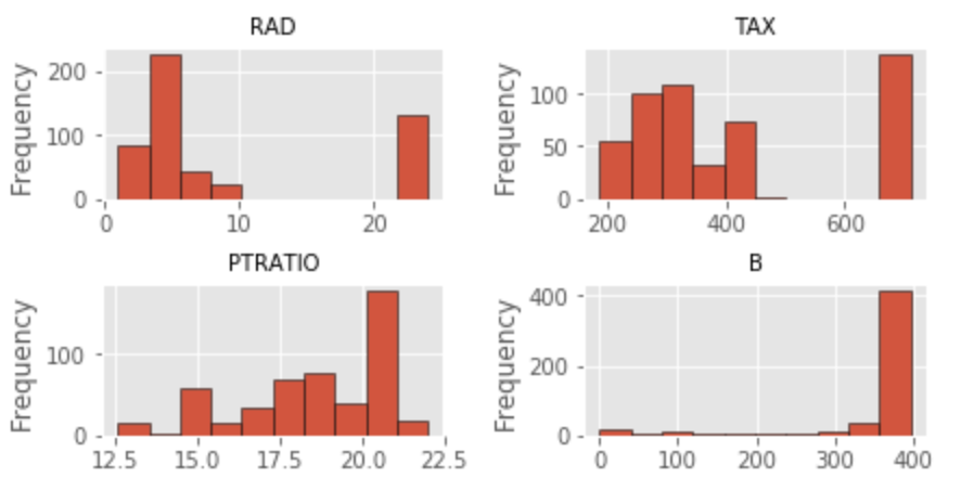
The distribution of features is far from ideal. With the exception of RM, all other features exhibit a non-normal distribution. For now, I will leave this alone and attempt to fix the problem later. I also noticed that one variable (CHAS) is binary categorical.
#Linear Relationship:  There should be a linear relationship between predictors and response variable
for index, feature_name in enumerate(boston.feature_names):
    plt.figure(figsize=(6, 3))
    plt.scatter(boston.data[:, index], boston.target)
    plt.ylabel('Home Value', size=15)
    plt.xlabel(feature_name, size=15)
    plt.tight_layout(pad=0.4, w_pad=0.5, h_pad=1.0)
#Assess distribution of features
for index, feature_name in enumerate(boston.feature_names):
    plt.figure(figsize=(4, 3))
    plt.hist(boston.data[:, index])
    plt.ylabel('Frequency', size=15)
    plt.xlabel(feature_name, size=15)
    plt.tight_layout()

Linearity Assumption:
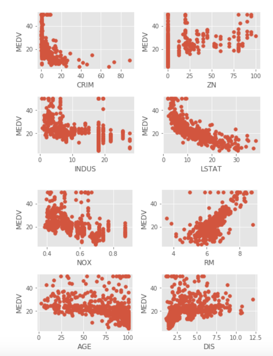
When fitting a linear regression model, it is assumed that there is a linear relationship between each regressor and the target. The first task is to plot each regressor against the target (MEDV). Residual analysis will also be completed after the model is fit to look at the same problem.
Multiple plots show non-linear relationships (ZN, INDUS, NOX, LSTAT, AGE, DIS, B). CRIM has multiple extreme observations, while observations at the 0 CRIM level have no relationship with home values. RAD and TAX has no relationship with Home values at the highest levels, certainly a cause of concern.

Correlations:
One should always look at a correlation matrix. It shows which feature is correlated with the target and the direction of that correlation. One would like to see significant/high correlations between the regressors and the target variable (negative or positive depending on whether a feature is expected to have a positive or negative impact on home values). For example, crime rates should be inversely correlated with home prices.
Correlation coefficients can be evaluated by a rudimentary rule of thumb: 0 means no correlation, 0.01-.3 weak, 0.31-0.7 moderate, 0.7-0.9 strong, 0.9-1 very strong. In our example, only two variables reach the vicinity of 0.7, LSTAT and RM.
#Take a look at correlations
#Correlation between features and target is preferred
#Correlation between features is suspicious

boston_df[['CRIM','ZN', 'NOX', 'INDUS','CHAS','NOX', 'RM', 'AGE', 'DIS', 'RAD', 'TAX', 'PTRATIO', 'B', 'LSTAT', 'MEDV']].corr()
Also, cross correlation between regressors is not desirable because of the collinearity principle of regression. Multicollinearity will be discussed in a few paragraphs. The output of the correlation table below shows the cross-correlation of all variables. Unfortunately, the Boston Housing dataset contains lots of moderate to strong cross-correlations between regressors. I cut the picture on the right at B because it was too large to see.
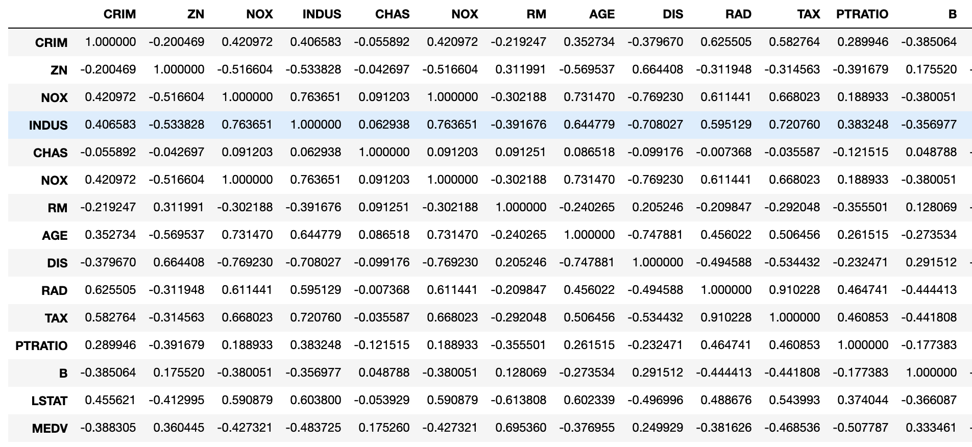
The seaborn package may also be helpful to visualize correlations. Note the legend on the right side. Darker colors mean stronger correlations, although the directionality of correlations is not available. Several regressors are correlated considerably, which is a grave concern and will have to be addressed in regression modeling.
We are now ready to fit a model!
#Visualize corelations
import seaborn as sns, numpy as np
ax=sns.heatmap(boston_df[['CRIM','ZN', 'NOX', 'INDUS','CHAS','RM', 'AGE', 'DIS', 'RAD', 'TAX', 'PTRATIO', 'B', 'LSTAT', 'MEDV']].corr(),
               cmap=sns.cubehelix_palette(20, light=0.95, dark=0.15))
ax.xaxis.tick_top

Regression Model:
In order to use Scikit-learn, the module needs to be installed. This can be done using a terminal window and #pip install -U scikit-learn. An important note is that sklearn import does not automatically install sub packages, hence they must be installed one by one. In this example, I had to install model_selection import train_test_split, which will be used for partitioning the dataset.
import sklearn
from sklearn.model_selection import train_test_split #sklearn import does not automatically install sub packages
from sklearn import linear_model
import statsmodels.api as sm
import numpy as np
For statistical learning, it is necessary to partition the dataset. When partitioning the data with sklearn, we need to create a data frame that has all regressors and another data frame that has the target variable. Note that the original data was already provided that way, I just concatenated the two data frames because I thought it was useful to have a single data frame for EDA. Some may consider that not necessary…
Here, I held on to 80% of the data for training and set aside 20% for testing. We can see that 404 observations are now considered training in both Y_train (target) and X_train data frames (features) date frames. The test data sizes are 102 in both corresponding data frames.
#Partition the data
#Create training and test datasets
X = boston_df.drop('MEDV', axis = 1)
Y = boston_df['MEDV']

X_train, X_test, Y_train, Y_test = sklearn.model_selection.train_test_split(X, Y, test_size = 0.20, random_state = 5)
print(X_train.shape)
print(X_test.shape)
print(Y_train.shape)
print(Y_test.shape)
(404, 13)
(102, 13)
(404,)
(102,)
Let’s run our first regression model and see how we did. The intercept and coefficients can be manually printed. I also printed a plot that compares actual and predicted home values based on the test data. We can observe some significant problems. As an example, a large number of actual values were predicted to be higher indicating a poor model fit and accuracy.
#Train regression model
from sklearn.linear_model import LinearRegression
lin_mod1 = LinearRegression()
lin_mod1.fit(X_train, Y_train)
#Create predictions using test features
Y_pred = lin_mod1.predict(X_test)
#Compare predicted and actual MEDV still based on train data
plt.scatter(Y_test, Y_pred)
plt.xlabel("Actual Home Value")
plt.ylabel("Predicted Home Value")
plt.title("Home Values: Actual vs Predicted")

#Print model parameters
print('Intercept: \n', lin_mod1.intercept_)
print('Coefficidents: \n', lin_mod1.coef_)
Intercept:
 37.91248700975083
Coefficidents:
 [-1.30799852e-01  4.94030235e-02  1.09535045e-03  2.70536624e+00
 -1.59570504e+01  3.41397332e+00  1.11887670e-03 -1.49308124e+00
  3.64422378e-01 -1.31718155e-02 -9.52369666e-01  1.17492092e-02
 -5.94076089e-01]
I also printed some goodness of fit statistics such as Mean Absolute Error, Mean Squared Error and Root Mean Squared Error. It is hard to judge whether these scores are good or bad until we start building newer, more appropriate models. All three - MAE, MSE and RMSE - were computed based on test data.
#Goodness of fit statistics: values closer to 0 are better
import sklearn
from sklearn import metrics

print('Mean Absolute Error:', metrics.mean_absolute_error(Y_test, Y_pred))
print('Mean Squared Error:', metrics.mean_squared_error(Y_test, Y_pred))
print('Root Mean Squared Error:', np.sqrt(metrics.mean_squared_error(Y_test, Y_pred)))
Mean Absolute Error: 3.4550349322483482
Mean Squared Error: 28.530458765974583
Root Mean Squared Error: 5.341391089030514
Finally, some very important model stats can be obtained from the OLS Regression Results table. First, the F-statistic is large at 661, which is certainly larger than 1, which allows us to reject the null hypothesis, and conclude that at least one of the variables must be related to the target MEDV. The R-squared is also very large at 0.738 indicating that the model explains 74% of the variance in the target variable. We also get two fit statistics Akaike Information Criterion and Bayesian Information Criterion, which are large but by themselves they are difficult to evaluate. They will be useful when fitting alternative models.
Unfortunately, we do have some variables that were not a significant contributor to the explanatory power of the model (INDUS, CHAS, NOX, AGE). We do get a warning in this table about multicollinearity: The condition number is large, 8.97e+03. This might indicate that there are strong multicollinearity or other numerical problems.
#Model statistics
#Ensure that constant is added: represets y-intercept
model = sm.OLS(Y_train, sm.add_constant(X_train)).fit()
print_model = model.summary()
print(print_model)

Non-linear relationships between regressors and the response:
We already saw during EDA that some of the features are not linearly related to the target. We can look at the non-linearity issue by plotting residuals vs. the fitted values. The plot should show no pattern, and the presence of a pattern indicates issues with the linearity assumption. Further, the points should be horizontally distributed. The residual plot shows a U-shaped pattern, which is an indication of non-linearity.
Plotting observed vs. predicted values against each other may also be helpful. Linearity will cause points to be symmetrically distributed along the diagonal of the plot, while non-symmetrical distribution is an indication of violation of non-linearity assumption.
#RESIDUAL ANALYSIS: CHECK FIT OF TRAINED MODEL
predictions = lin_mod1.predict(X_train) #make predictions with train data/use sklearn
residual=Y_train-predictions
residual.head()
33    -0.728770
283    5.471472
418    4.884009
502   -1.777959
402   -6.135923
Name: MEDV, dtype: float64
#RESIDUALS VS. FITS
plt.axhline(y=0, color='k', linestyle=':') #draw a black horizontal line when residuals equal 0

plt.scatter(predictions, residual, color='#003F72')
plt.title('Versus Fits')
plt.xlabel('Predicted Values')
plt.ylabel('Residuals')
plt.show()

Right type of regression used:
The Versus Fits plot is also useful in determining whether the right type of regression has been used. The curved pattern shows that the chosen regression was of the wrong type.
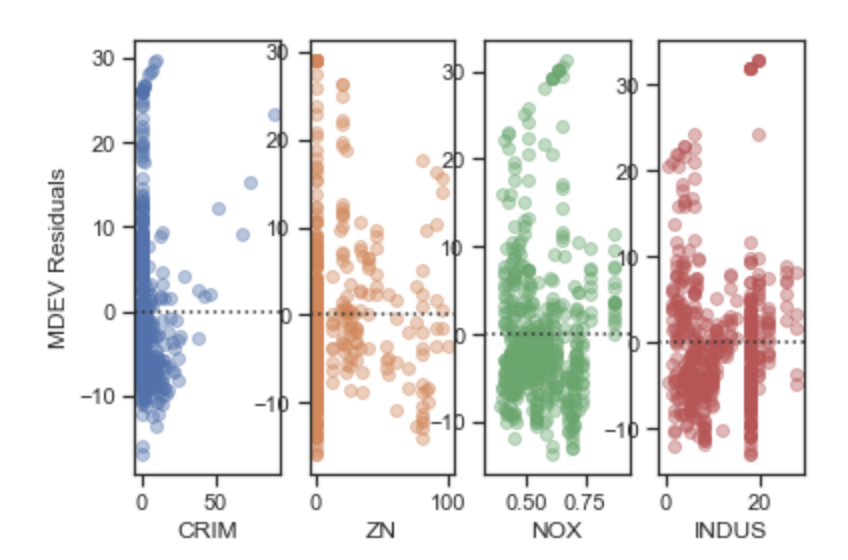
Correlation of error terms:
As discussed earlier, an important assumption of linear regression modeling is that the error terms must NOT be correlated. Correlations among the error terms causes the standard errors underestimated and the confidence in prediction intervals will be narrower. Additionally, the p-values in the model will be underestimated, which may prompt us to consider a parameter statistically significant in error. When error terms are correlated, the fits vs. residuals plot frequently appears in the shape of a funnel.
Independence (or no correlation) is typically expressed based on error terms, e.g. the error terms must be independent. Since the error terms are not known, we can estimate them by subtracting fitted values from actual values for each observation.
The best way to check the independence assumption is to plot residuals against regressor values. A random pattern shows independence, while a plot with a shape is usually an indication of the error terms being correlated. The plots below show clear patterns for all variables indicating that the independence assumption of regression is violated.
#Plot feature residuals vs. each feature
fig, ax=plt.subplots(1,4)
ax[0]=sns.residplot('CRIM','residual', res_feat, ax=ax[0], scatter_kws={'alpha':0.4})
ax[0].set_ylabel('MEDV Residuals')
ax[1]=sns.residplot('ZN','residual', res_feat, ax=ax[1], scatter_kws={'alpha':0.4})
ax[1].set_ylabel('')
ax[2]=sns.residplot('NOX','residual', res_feat, ax=ax[2], scatter_kws={'alpha':0.4})
ax[2].set_ylabel('')
ax[3]=sns.residplot('INDUS','residual', res_feat, ax=ax[3], scatter_kws={'alpha':0.4})
ax[3].set_ylabel('')
#Plot feature residuals vs. each feature
fig, ax=plt.subplots(1,4)
ax[0]=sns.residplot('CHAS','residual', res_feat, ax=ax[0], scatter_kws={'alpha':0.4})
ax[0].set_ylabel('MEDV Residuals')
ax[1]=sns.residplot('RM','residual', res_feat, ax=ax[1], scatter_kws={'alpha':0.4})
ax[1].set_ylabel('')
ax[2]=sns.residplot('AGE','residual', res_feat, ax=ax[2], scatter_kws={'alpha':0.4})
ax[2].set_ylabel('')
ax[3]=sns.residplot('RAD','residual', res_feat, ax=ax[3], scatter_kws={'alpha':0.4})
ax[3].set_ylabel('')

Non-constant variance of error terms or heteroscedasticity:
When variances of the error terms increase with the value of the response (e.g. the vs. fit plot exhibits a funnel shape), we are dealing with heteroscedasticity or non-constant variances. Transformation of the variables may help the problem but at least for now, we can spot it on a plot.
The Vs. Fits plot of the Boston Housing shows an initially decreasing and then increasing variance of error terms as the value of predicted observations increase. There are hypothesis tests that are available for testing the homoscedasticity assumption, but these tests are notoriously unreliable because they themselves are based on models with a sets of assumptions.
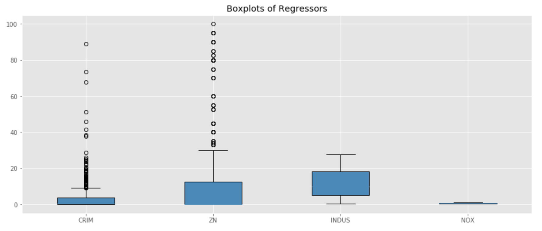
Outliers:
An outlier is an observation that is far from its predicted value. Outliers may have an impact on the regression line although that impact may not be significant. However, outliers may have an impact on the RSE score, even if they do not have an impact on the OLS fit. RSE is used for the computation of confidence intervals and p-values, therefore outliers do have an impact on how we interpret model statistics. Outliers can also have a negative impact on R squared values by making them smaller in error.
There are alternative ways to find outliers. One effective way of finding outliers is to plot the studentized residuals (e.g. take each residual and divide by its estimated standard error ). Observations above 3 are usually outliers.
The IQR method is yet another method one could consider using. An observation may be considered an outlier if it is outside of the IQR range. Other thresholds may also be considered and the threshold is simply based on tolerance by the analyst.
#Detect outliers
import numpy as np
import matplotlib.pyplot as plt
#Visualize outliers using boxplots
#I did not plot CHAS given it is binary
np.random.seed(10)
array1 = boston_df['CRIM']
array2 = boston_df['ZN']
array3 = boston_df[ 'INDUS']
array4 = boston_df['NOX']

data = [array1, array2, array3, array4]
fig = plt.figure(1, figsize=(15, 6))
ax = fig.add_subplot(111)
res = ax.boxplot(data, patch_artist=True)
plt.title('Boxplots of Regressors')
ax.set_xticklabels(['CRIM','ZN', 'INDUS','NOX'])
plt.show()
#Visualize outliers using boxplots
#I did not plot CHAS given it is binary
np.random.seed(10)
array9 = boston_df['TAX']
array10 = boston_df['PTRATIO']
array11 = boston_df['B']
array12 = boston_df['LSTAT']
array13 = boston_df['MEDV']

data = [array9, array10, array11, array12, array13]
fig = plt.figure(1, figsize=(15, 6))
ax = fig.add_subplot(111)
res = ax.boxplot(data, patch_artist=True)

plt.title('Boxplots of Regressors')
ax.set_xticklabels(['TAX', 'PTRATIO', 'B', 'LSTAT', 'MEDV'])

plt.show()

np.random.seed(10)
array5 = boston_df['RM']
array6 = boston_df['AGE']
array7 = boston_df['DIS']
array8 = boston_df['RAD']

data = [array5, array6, array7, array8]
fig = plt.figure(1, figsize=(15, 6))
ax = fig.add_subplot(111)
res = ax.boxplot(data, patch_artist=True)

plt.title('Boxplots of Regressors')
ax.set_xticklabels(['RM', 'AGE', 'DIS', 'RAD'])

plt.show()

#Outlier detection using z score
from scipy import stats
import numpy as np
z = np.abs(stats.zscore(boston_df))

#Define threshold for outliers
#1st array shows row number of outlier location
#2nd array shows column number of outlier location
threshold = 3
print(np.where(z > 3))

(array([ 55,  56,  57, 102, 141, 142, 152, 154, 155, 160, 162, 163, 199,
       200, 201, 202, 203, 204, 208, 209, 210, 211, 212, 216, 218, 219,
       220, 221, 222, 225, 234, 236, 256, 257, 262, 269, 273, 274, 276,
       277, 282, 283, 283, 284, 347, 351, 352, 353, 353, 354, 355, 356,
       357, 358, 363, 364, 364, 365, 367, 369, 370, 372, 373, 374, 374,
       380, 398, 404, 405, 406, 410, 410, 411, 412, 412, 414, 414, 415,
       416, 418, 418, 419, 423, 424, 425, 426, 427, 427, 429, 431, 436,
       437, 438, 445, 450, 454, 455, 456, 457, 466]), array([ 1,  1,  1, 11, 12,  3,  3,  3,  3,  3,  3,  3,  1,  1,  1,  1,  1,
        1,  3,  3,  3,  3,  3,  3,  3,  3,  3,  3,  3,  5,  3,  3,  1,  5,
        5,  3,  3,  3,  3,  3,  3,  1,  3,  1,  1,  7,  7,  1,  7,  7,  7,
        3,  3,  3,  3,  3,  5,  5,  5,  3,  3,  3, 12,  5, 12,  0,  0,  0,
        0,  5,  0, 11, 11, 11, 12,  0, 12, 11, 11,  0, 11, 11, 11, 11, 11,
       11,  0, 11, 11, 11, 11, 11, 11, 11, 11, 11, 11, 11, 11, 11]))
print(z[142][3])  #As an example, print outlier value

3.668397859712446

#IQR method
Q1 = boston_df.quantile(0.25)
Q3 = boston_df.quantile(0.75)
IQR = Q3 - Q1
print(IQR)

#False is not outlier
#True is outlier
print(boston_df < (Q1 - 1.5 * IQR)) |(boston_df > (Q3 + 1.5 * IQR))

 CRIM     ZN  INDUS   CHAS    NOX     RM    AGE    DIS    RAD    TAX  \
0    False  False  False  False  False  False  False  False  False  False
1    False  False  False  False  False  False  False  False  False  False
2    False  False  False  False  False  False  False  False  False  False
3    False  False  False  False  False  False  False  False  False  False
4    False  False  False  False  False  False  False  False  False  False
5    False  False  False  False  False  False  False  False  False  False
6    False  False  False  False  False  False  False  False  False  False
7    False  False  False  False  False  False  False  False  False  False
8    False  False  False  False  False  False  False  False  False  False
9    False  False  False  False  False  False  False  False  False  False
10   False  False  False  False  False  False  False  False  False  False
11   False  False  False  False  False  False  False  False  False  False
12   False  False  False  False  False  False  False  False  False  False
13   False  False  False  False  False  False  False  False  False  False
14   False  False  False  False  False  False  False  False  False  False
15   False  False  False  False  False  False  False  False  False  False
16   False  False  False  False  False  False  False  False  False  False
17   False  False  False  False  False  False  False  False  False  False
18   False  False  False  False  False  False  False  False  False  False
19   False  False  False  False  False  False  False  False  False  False
Presence of influential observations or high-leverage points:
High leverage points have a significant impact on the regression line, which may be a significant problem if the fitted model is impacted by a handful of observations. In fact, the entire fit may be compromised by high leverage points. Leverage statistic is the best way to identify high leverage points. The leverage statistic is always between 1/n and 1 and it equals (p+1)/n where p is the number of features. Any observation that exceeds the leverage statistic by a considerable number can be deemed a high leverage value. Plotting predicted and actual observations may also be very helpful.
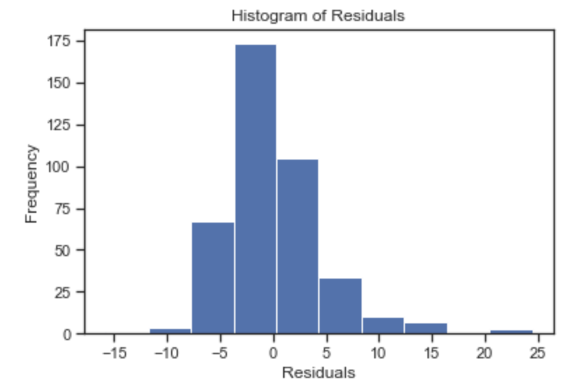
Normal Distribution
I plotted the histogram of residuals but the selection of bin width influences the picture of the distribution. A far better way to assess the normality assumption is to use a Q-Q plot. This is a probability plot designed to show whether the data came from a normal distribution. If it did, the plot will lie along the diagonal line.
Q-Q plots are also useful to visualize outliers, which are observations far deviating from the diagonal at the upper or lower edges.
The the case of our Boston housing data, the normal distribution is violated toward the upper edge of the diagonal line. These points could be observed in the original histogram of the target variable , MEDV.
#Assess Q-Q plot
import numpy as np
import numpy.random as random
import pandas as pd
import matplotlib.pyplot as plt
%matplotlib inline

data=residual.values.flatten()
data.sort()
norm=random.normal(0,2,len(data))
norm.sort()
plt.figure(figsize=(12,8),facecolor='1.0')
plt.plot(norm,data,"o")

#generate a trend line as in http://widu.tumblr.com/post/43624347354/matplotlib-trendline
z = np.polyfit(norm,data, 1)
p = np.poly1d(z)
plt.plot(norm,p(norm),"k--", linewidth=2)
plt.title("Normal Q-Q plot", size=16)
plt.xlabel("Theoretical quantiles", size=12)
plt.ylabel("Expreimental quantiles", size=12)
plt.tick_params(labelsize=12)
plt.show()

#HISTOGRAM OF RESIDUALS
import matplotlib.pyplot as plt
import numpy as np
import pandas as pd
x = residual

plt.title('Histogram of Residuals')
plt.hist(x, bins=10)
plt.ylabel('Frequency')
plt.xlabel('Residuals')
plt.show()
Multicollinearity:
Multicollinearity refers to correlations among multiple features. As a result of cross-correlation among multiple variables, it is difficult to tease out the effect of individual regressors on the target. Collinearity impacts the accuracy of estimates negatively and the standard error to increase. Collinearity may also result in lower t scores, which may cause us to deem a feature significant in error.
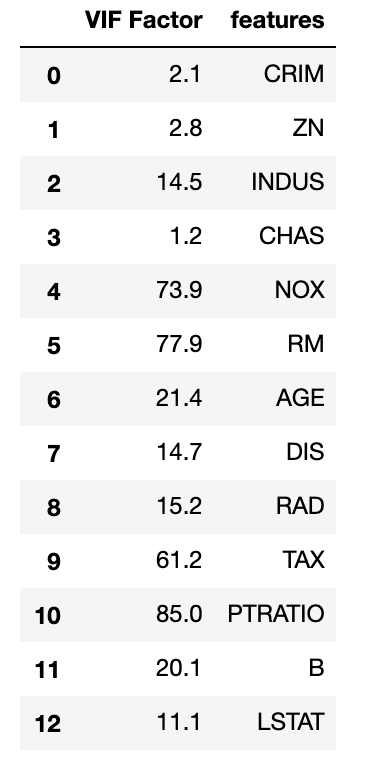
Note that the correlation matrix is not good enough to detect collinearity because it is possible to have collinearity between variables even if the bivariate coefficient of correlation is not significant, which is called multicollinearity. It can be detected by computing the variance inflation factor. When VIF is 1, there is no collinearity. When values exceed 5 or 10, we detected collinearity. In smaller samples 5 is the preferred cutoff, while in larger sample sizes 10 is acceptable.
Eigen vectors vectors may also indicate multicollinearity when their values are closer to zero.
#test for multicollinearity
from sklearn.preprocessing import StandardScaler
X_std = StandardScaler().fit_transform(X_train)

#eigen vector of a correlation matrix
#Values close to 0 indicate multicollinearity

cor_mat1 = np.corrcoef(X_std.T)

eig_vals, eig_vecs = np.linalg.eig(cor_mat1)

print('Eigenvectors \n%s' %eig_vecs)
print('\nEigenvalues \n%s' %eig_vals)
Eigenvectors
[[-2.47425034e-01 -3.08439366e-01  2.09248686e-01  1.01636242e-01
  -8.63284961e-02  3.98731240e-01 -7.13059605e-01  2.30038555e-01
   3.53108937e-02  2.00168407e-01 -4.34946053e-02 -8.90053883e-02
   1.02918090e-01]
 [ 2.59465494e-01 -3.03852310e-01  3.08184478e-01  2.57878387e-01
  -2.91677002e-01  2.26824721e-01  2.95040340e-01 -3.67243847e-01
  -8.09119998e-02  4.01319376e-01 -2.83337203e-01  3.73540332e-02
  -2.66742263e-01]
 [-3.49317701e-01  9.63503477e-02  1.62017988e-02  4.23414641e-02
   4.21966831e-02 -2.93107974e-04  3.32283831e-01  1.98623118e-01
  -2.36033886e-01  6.33634727e-01  3.08848133e-01  1.46983627e-01
   3.75230336e-01]
 [-1.58413963e-02  4.89778959e-01  2.90932911e-01  7.67269472e-01
   1.27290114e-01 -1.93209476e-01 -1.64595683e-01 -4.08417991e-02
   3.63737232e-02 -4.21500956e-02  1.97249150e-02  2.10903272e-02
  -1.71814075e-02]
 [-3.48158306e-01  2.06075299e-01  1.31391367e-01 -7.20965654e-02
  -1.36293859e-01  1.01002058e-01  2.25604851e-01  6.75586623e-02
   2.69677760e-02 -1.12684470e-02 -2.07529931e-02 -8.24986376e-01
  -2.18473247e-01]
 [ 1.79205418e-01  7.95939845e-02  6.08722261e-01 -3.84736366e-01
   3.50496132e-01  1.15419511e-02 -1.17762420e-01 -3.12081174e-01
   4.08492966e-02  6.80522448e-02  4.45804588e-01 -3.75648343e-02
  -4.78469613e-02]
 [-3.08995756e-01  3.14823557e-01 -1.91909625e-02 -2.01155809e-01
  -6.71041036e-02  1.03990180e-01 -1.19265027e-01 -6.04157758e-01
  -3.40117244e-02 -2.01723975e-02 -4.26468677e-01  6.19762813e-02
   4.27490142e-01]
 [ 3.23492791e-01 -3.33523253e-01 -6.79163814e-02  2.52856024e-01
  -5.59036323e-02 -6.16901636e-02  4.99813925e-02 -1.80913849e-01
  -1.95982054e-02 -1.53677467e-01  2.30893964e-01 -4.26917951e-01
   6.43300230e-01]
 [-3.25594165e-01 -2.84857499e-01  2.53882962e-01  1.08556728e-01
   2.01001427e-01  9.73672914e-02  1.74797089e-01  7.75906659e-03
  -6.35374498e-01 -4.85838525e-01 -4.06950400e-02  1.18312710e-01
  -2.67119214e-02]
 [-3.39352638e-01 -2.53798191e-01  2.14046890e-01  1.07442984e-01
   1.35993393e-01  1.12321675e-01  3.39968259e-01  2.95879479e-02
   7.25326633e-01 -1.95286675e-01 -2.43384726e-02  1.83743437e-01
   1.30047498e-01]
 [-2.07430872e-01 -3.12911598e-01 -3.45365060e-01  1.36922402e-01
   6.16666812e-01 -2.47626986e-01 -1.13996349e-01 -3.11834420e-01
   2.33334241e-02  2.75184941e-01 -8.20263476e-02 -1.87628181e-01
  -2.25825564e-01]
 [ 1.92624946e-01  2.40570161e-01 -3.02691516e-01  1.28421804e-01
   3.44296160e-01  8.01110351e-01  1.26067534e-01 -3.76695529e-02
  -5.98936097e-03 -5.37210657e-02  1.24719666e-01 -3.19367173e-03
  -2.81182396e-02]
 [-3.07288532e-01 -5.36028227e-02 -2.49747151e-01  1.28395066e-01
  -4.27461429e-01  4.56751887e-02 -1.02393658e-01 -4.14492973e-01
   2.92358545e-02 -1.18470805e-01  6.02627805e-01  1.32461368e-01
  -2.47278848e-01]]

Eigenvalues
[6.12706048 1.39238017 1.28490134 0.85003081 0.80094028 0.70400183
 0.53834139 0.40473886 0.05872764 0.26533046 0.22706882 0.16363976
 0.18283815]
import statsmodels.api as sm
from statsmodels.stats.outliers_influence import variance_inflation_factor

# For each X, calculate VIF and save in dataframe
vif = pd.DataFrame()
vif["VIF Factor"] = [variance_inflation_factor(X.values, i) for i in range(X.shape[1])]
vif["features"] = X.columns
vif.round(1)