

Predictive Modeling in Support of Email Campaign: EDA

Project Description:
A not-for-profit organization wants to execute a direct mail campaign and maximize the profitability (dollar volume of donations vs. the cost of execution) of said campaign. A database of previous donors is available for analysis. The project was divided into three parts:
During the first phase, we will predict, which individual in our database is likely to send a donation (a classification problem).
The second phase will predict the expected amount of donations from each individual (a regression problem).
The third phase of the project will be a financial exercise examining the profitability of the campaign.
Table of Contents:
In order to arrive at the most accurate prediction, machine learning models are built, tuned and compared against each other. The reader can get can click on the links below to assess the models or sections of the exercise. Each section has a short explanation of theory, and a description of applied machine learning with Python:
Exploratory Data Analysis:
A dataset of 6,002 observations were made available from a charitable organization. The data contained 23 variables that provided demographic and behavioral information about past donors to the organization.
Exploratory Data Analysis was conducted on the training data. All variables were examined in terms of their relationship with past donor behavior (e.g. did subject donate).
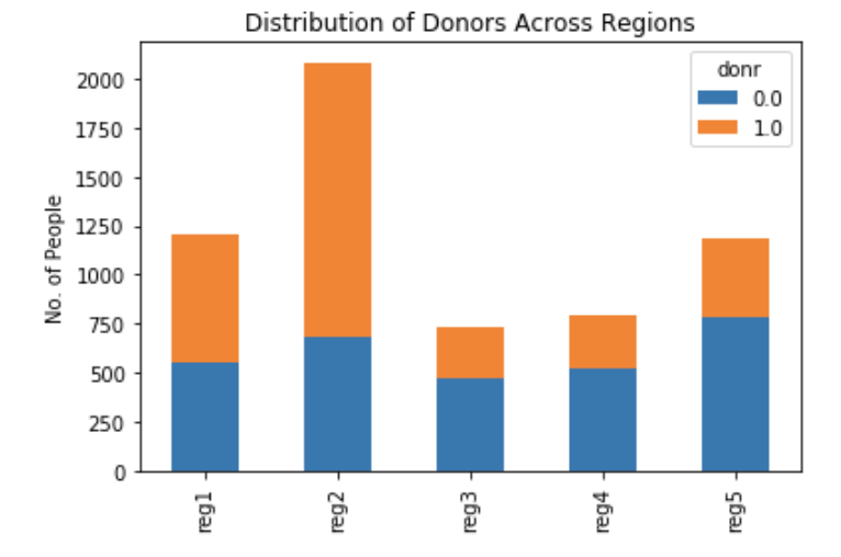
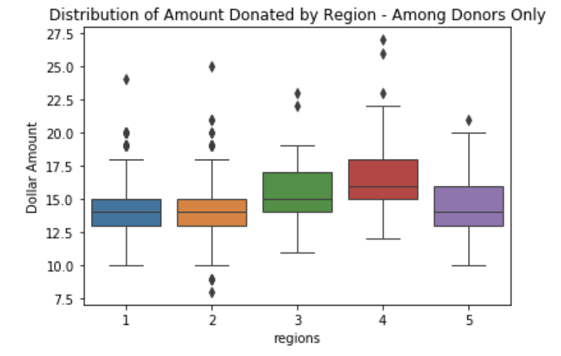
Region:
All subjects were assigned to five geographic regions. Region 1 contained 20.1% of all observations (n=1,209), Region 2 accounted for 34.7% of observations (n=2,083), Region 3 had 12.1% of cases (n=728). In contrast, Region 4 (n=795), and Region 5 (n=1,187) accounted for 13.2% and 19.8% of the total, respectively. Donor behavior was clearly differentiated across the five regions. People living in Region 1 and Region 2 were more likely to donate than those living in other regions. However, average amounts donated were higher when the donor lived in Regions 3 or 4.
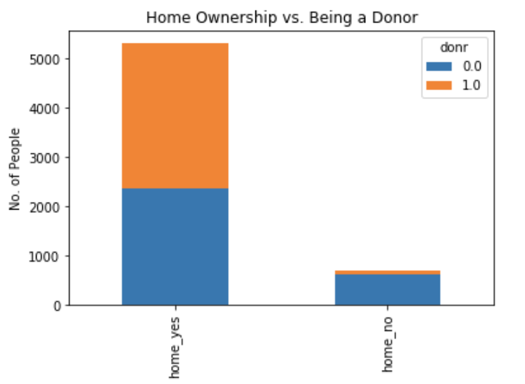
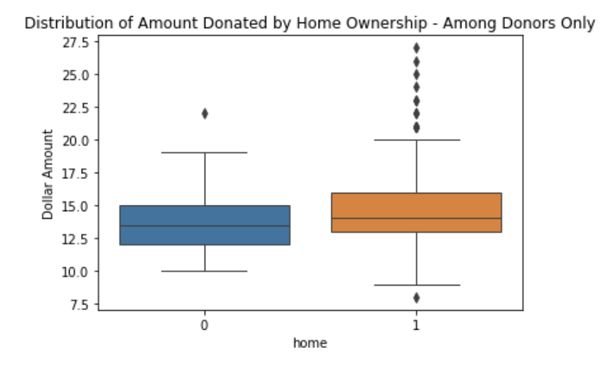
Home Ownership:
There were 5,309 home owners in the dataset compared to only 693 people who did not own a home. The bar chart below clearly indicates that homeownership is more likely to be associated with donating behavior, whereas those not owning a home are not at all likely to donate. Further, the average amount donated appears to be higher among home owners vs. the amount donated by those without home ownership. Do note that there were several homeowners who donated more than the norm.
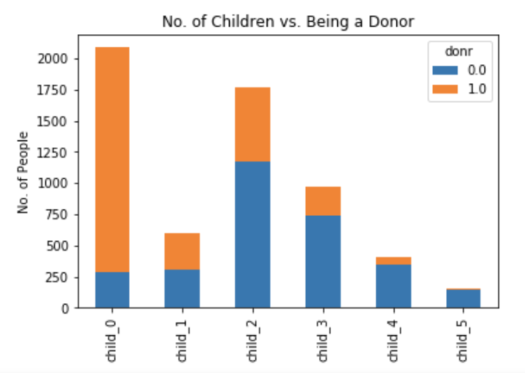
Number of Children:
There were 2,088 people in the data with no children, while 598 people had one child. About 1,771 individuals had two children, while 973 people had three children and 412 subjects had four kids. Only 160 individuals had five children.
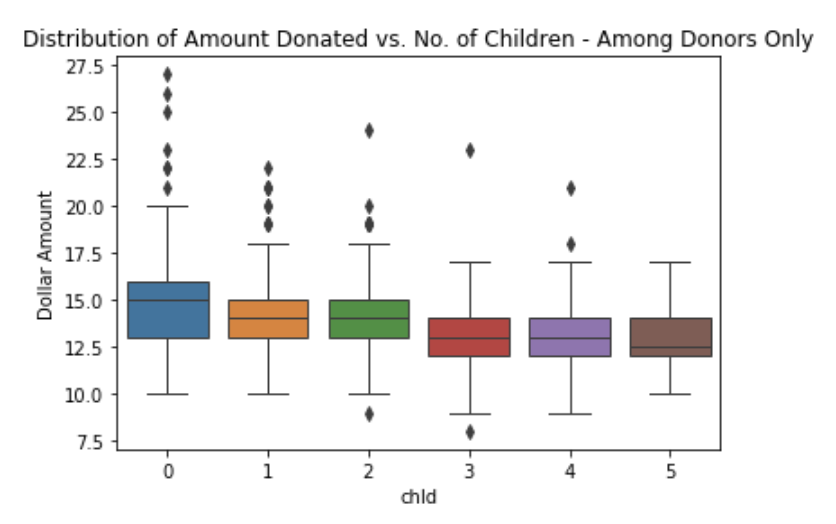
The number of children does appear to influence donating behavior. For example, individuals without children were far more likely to donate, and the likelihood of becoming a donor declined as the number of children increased in the household. The amount donated also declined with the increase in the number of children.
Household Income:
Each subject was categorized into one of seven household income categories. Most households belonged to category four, while the rest were approximately normally distributed around the most frequent category. The variable appeared to be a good predictor of donor behavior as a larger percentage of those in category four were likely donors than those in other income categories. The amount of donations increased with the increase in income category designation (e.g. the more money a person makes, the higher the donated amount).


Gender:
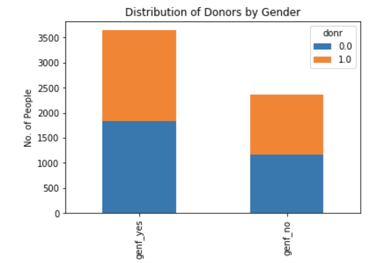
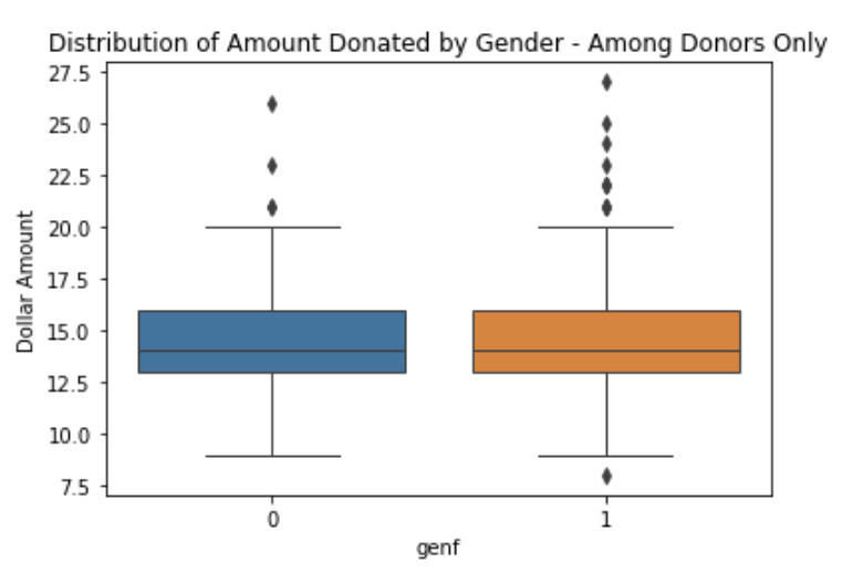
While slightly more males than females were included as subjects in the dataset, the distribution of donors vs. non-donors was about equal for both genders suggesting that the variable may not be a good predictor of donor behavior. Also, the median amount donated appeared to be about the same for male and female subjects.
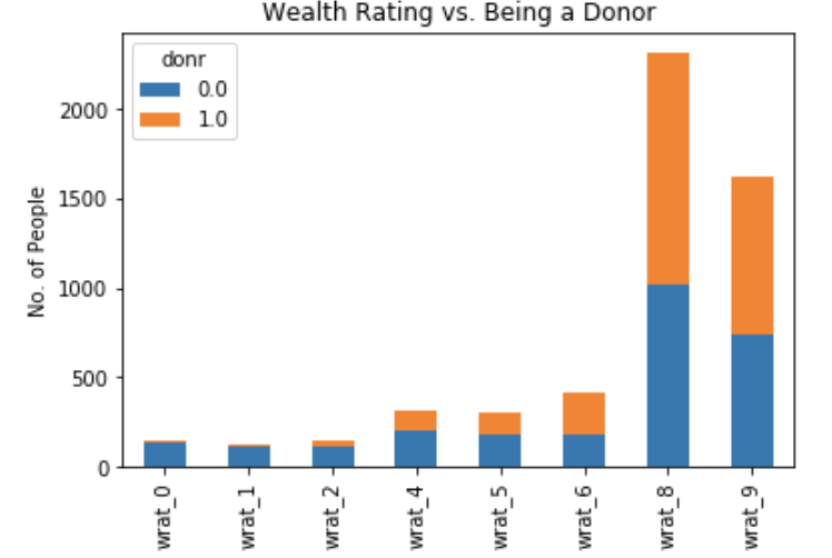
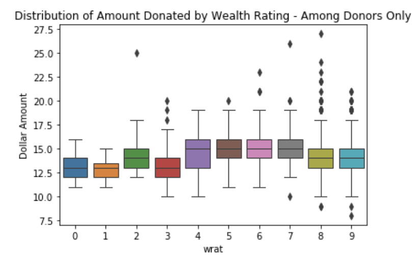
Wealth Rating:
Wealth rating was based on median family income and population statistics indexed to relative wealth within each state, and classified individuals into segments ranging between 0 and 9 (0 being the lowest and 9 being the highest). The plot clearly indicates that the wealthiest segments are most likely to become donors, while the poorest segments are very unlikely to donate. Interestingly, the wealthiest two segments were not those who donated the most in terms of total amounts. The median amount donated was highest for segments 4-7. However, there were unusually high amounts donated by certain individuals belonging to the wealthiest groups.
Distribution of Variables:
The graphs show the following (left to right): Regions 1-5, Home Ownership, No. of Children, Household Income, Gender, Wealth Rating, Average Home Value, Median Family Income in Neighborhood, Average Family Income in Neighborhood, Percent low income potential donor in neighborhood, Lifetime number of promotions received, Dollar amount of lifetime gifts to date, Dollar amount of largest gift to date, Dollar amount of most recent gift, Number of months since last donation, Number of months between first and second gift, Average dollar amount of gifts to date , Donor Classification, Amount Donated.
We have seen many of the distributions in some pf the prior bar graphs, although they were presented in the context of donor behavior. The lower half of the table here has not been explored. None of the variables show normal distributions.

Correlations:
A correlation matrix revealed significant correlations among some of the variables. They appear as dark or black on the matrix below. These correlations should make us pause when thinking about fitting some model types (such as LDA), while other methods may not be as affected by the issue. Either way, multicollinearity will be a topic to explore during the analytics phase.

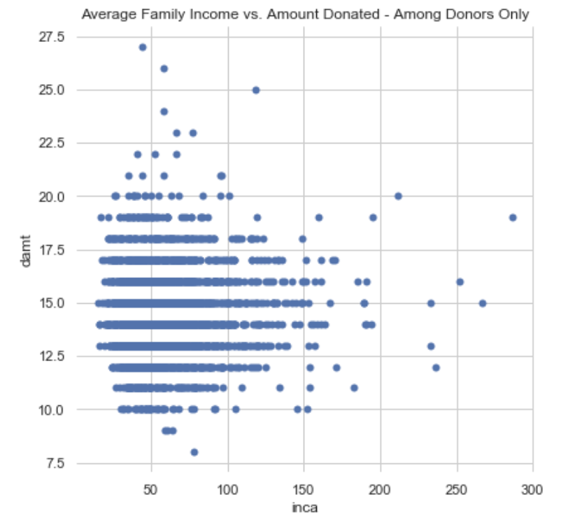
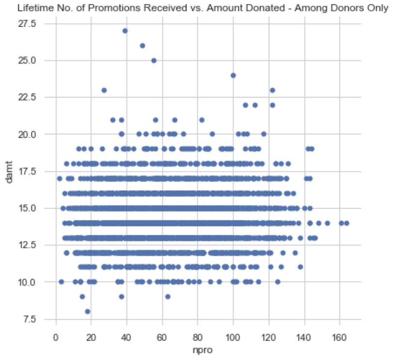
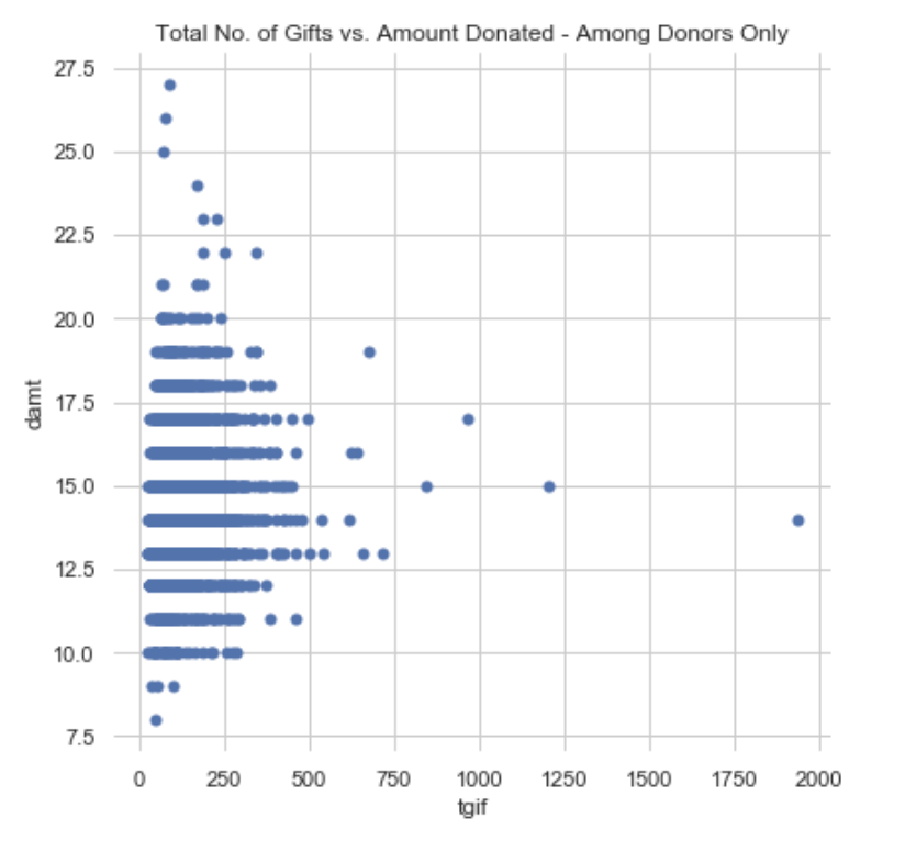
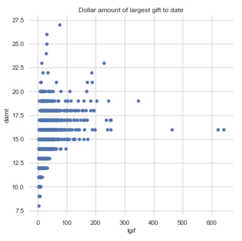
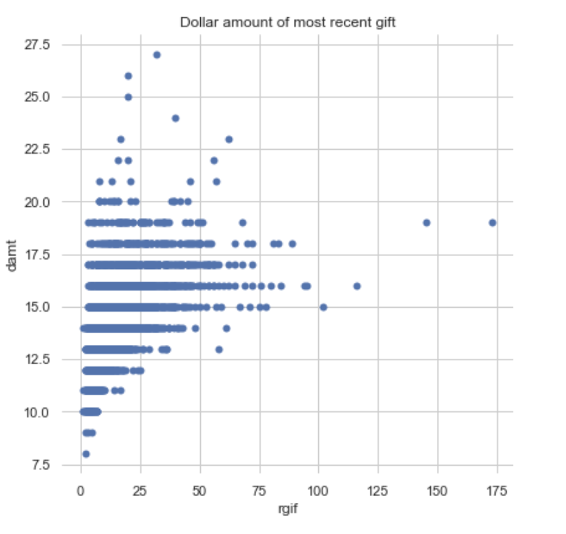
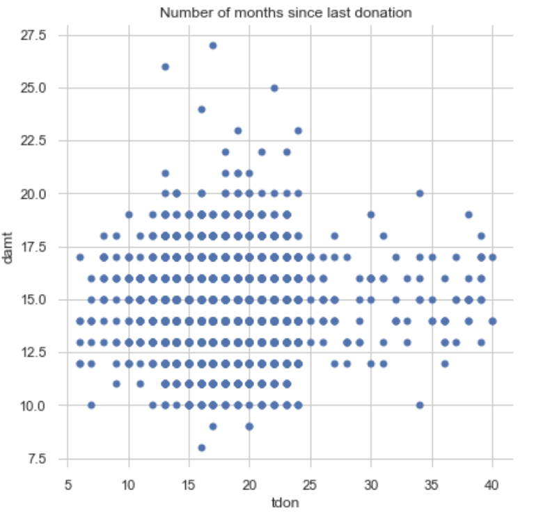
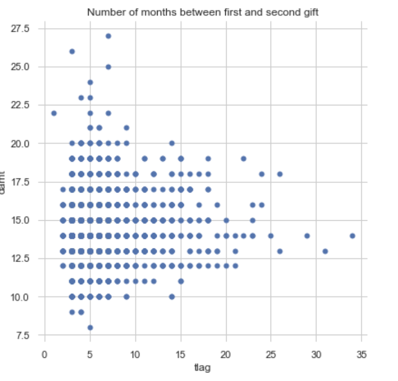
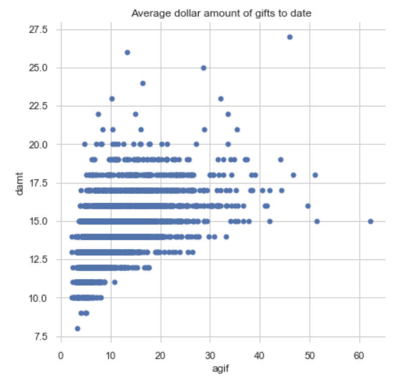
Bivariate Plots:
Finally, some bivariate plots to assess potential relationships between features and the target variable. Some of them do show a shape indicating a relationship, none of which appears to be linear. Click on the right or left arrow to advance the slide reel.
Code Used:
The code that was used to create he graphs and plots in the blog is provided below. I had to manipulate some of the variables so that they appear in the right format. These manipulations are also provided.
import numpy as np
import pandas as pd
import seaborn as sns
import matplotlib.pyplot as plt

#read csv file
charity_df = pd.read_csv('charity.csv')
charity_df.head(25)

charity_df.isnull().sum()

#remove all lines with missing observations
charity_df=charity_df.dropna()
print(charity_df.shape)
print(charity_df.dtypes)
charity_df.isnull().sum()
#charity_df.info()

#Distribution of population by region
r1_freq=charity_df['reg1'].groupby(charity_df['reg1']).sum()
r2_freq=charity_df['reg2'].groupby(charity_df['reg2']).sum()
r3_freq=charity_df['reg3'].groupby(charity_df['reg3']).sum()
r4_freq=charity_df['reg4'].groupby(charity_df['reg4']).sum()

def function(region5):
    if (region5['reg1'] == 0) & (region5['reg2'] == 0) & (region5['reg3'] == 0) & (region5['reg4'] == 0) : return 1
    else: return 0
charity_df['reg5'] = charity_df.apply(function, axis=1)

r5_freq=charity_df['reg5'].groupby(charity_df['reg5']).sum()


print(r1_freq, r1_freq/6002)
print(r2_freq, r2_freq/6002)
print(r3_freq, r3_freq/6002)
print(r4_freq, r4_freq/6002)
print(r5_freq, r5_freq/6002)

#########################
#Split of donor/not donor by region
reg1_freq=charity_df['reg1'].groupby(charity_df['donr']).value_counts()
reg2_freq=charity_df['reg2'].groupby(charity_df['donr']).value_counts()
reg3_freq=charity_df['reg3'].groupby(charity_df['donr']).value_counts()
reg4_freq=charity_df['reg4'].groupby(charity_df['donr']).value_counts()

#Create reg5 variable for counting
def function(region5):
    if (region5['reg1'] == 0) & (region5['reg2'] == 0) & (region5['reg3'] == 0) & (region5['reg4'] == 0) : return 1
    else: return 0
charity_df['reg5'] = charity_df.apply(function, axis=1)
reg5_freq=charity_df['reg5'].groupby(charity_df['donr']).value_counts()

print(reg1_freq)
print(reg2_freq)
print(reg3_freq)
print(reg4_freq)
print(reg5_freq)

#Some calculations
#home
charity_df['home_yes'] = charity_df['home']
charity_df['home_no'] = 1-charity_df['home']
home_y=charity_df['home_yes'].groupby(charity_df['home_yes']).sum()
home_n=charity_df['home_no'].groupby(charity_df['home_no']).sum()
print(home_y)
print(home_n)

#children
children=charity_df['chld'].groupby(charity_df['chld']).value_counts()
print(children)

#Create variables for Seaborn graphs
#home
charity_df['home_yes'] = charity_df['home']
charity_df['home_no'] = 1-charity_df['home']
home_y=charity_df.groupby(charity_df['home_yes']).sum()
home_y=charity_df.groupby(charity_df['home_yes']).sum()

#child
charity_df.groupby('chld').count() #see the type of values available in chld

def f_child0(child0):
    if (child0['chld'] == 0) : return 1
    else: return 0
def f_child1(child1):
    if (child1['chld'] == 1) : return 1
    else: return 0
def f_child2(child2):
    if (child2['chld'] == 2) : return 1
    else: return 0
def f_child3(child3):
    if (child3['chld'] == 3) : return 1
    else: return 0
def f_child4(child4):
    if (child4['chld'] == 4) : return 1
    else: return 0
def f_child5(child5):
    if (child5['chld'] == 5) : return 1
    else: return 0
charity_df['child_0'] = charity_df.apply(f_child0, axis=1)
charity_df['child_1'] = charity_df.apply(f_child1, axis=1)
charity_df['child_2'] = charity_df.apply(f_child2, axis=1)
charity_df['child_3'] = charity_df.apply(f_child3, axis=1)
charity_df['child_4'] = charity_df.apply(f_child4, axis=1)
charity_df['child_5'] = charity_df.apply(f_child5, axis=1)

#hinc
charity_df.groupby('hinc').count() #see the type of values available in chld

def f_hinc1(hinc1):
    if (hinc1['hinc'] == 1) : return 1
    else: return 0
def f_hinc2(hinc2):
    if (hinc2['hinc'] == 2) : return 1
    else: return 0
def f_hinc3(hinc3):
    if (hinc3['hinc'] == 3) : return 1
    else: return 0
def f_hinc4(hinc4):
    if (hinc4['hinc'] == 4) : return 1
    else: return 0
def f_hinc5(hinc5):
    if (hinc5['hinc'] == 5) : return 1
    else: return 0
def f_hinc6(hinc6):
    if (hinc6['hinc'] == 6) : return 1
    else: return 0
def f_hinc7(hinc7):
    if (hinc7['hinc'] == 7) : return 1
    else: return 0

charity_df['hinc_1'] = charity_df.apply(f_hinc1, axis=1)
charity_df['hinc_2'] = charity_df.apply(f_hinc2, axis=1)
charity_df['hinc_3'] = charity_df.apply(f_hinc3, axis=1)
charity_df['hinc_4'] = charity_df.apply(f_hinc4, axis=1)
charity_df['hinc_5'] = charity_df.apply(f_hinc5, axis=1)
charity_df['hinc_6'] = charity_df.apply(f_hinc6, axis=1)
charity_df['hinc_7'] = charity_df.apply(f_hinc7, axis=1)

#genf
charity_df.groupby('genf').count() #see the type of values available in chld

charity_df['genf_yes'] = charity_df['genf']
charity_df['genf_no'] = 1-charity_df['genf']

#wrat
charity_df.groupby('wrat').count() #see the type of values available in chld

def f_wrat0(wrat0):
    if (wrat0['wrat'] == 0) : return 1
    else: return 0
def f_wrat1(wrat1):
    if (wrat1['wrat'] == 1) : return 1
    else: return 0
def f_wrat2(wrat2):
    if (wrat2['wrat'] == 2) : return 1
    else: return 0
def f_wrat3(wrat3):
    if (wrat3['wrat'] == 3) : return 1
    else: return 0
def f_wrat4(wrat4):
    if (wrat4['wrat'] == 4) : return 1
    else: return 0
def f_wrat5(wrat5):
    if (wrat5['wrat'] == 5) : return 1
    else: return 0
def f_wrat6(wrat6):
    if (wrat6['wrat'] == 6) : return 1
    else: return 0
def f_wrat7(wrat7):
    if (wrat7['wrat'] == 7) : return 1
    else: return 0
def f_wrat8(wrat8):
    if (wrat8['wrat'] == 8) : return 1
    else: return 0
def f_wrat9(wrat9):
    if (wrat9['wrat'] == 9) : return 1
    else: return 0

charity_df['wrat_0'] = charity_df.apply(f_wrat0, axis=1)
charity_df['wrat_1'] = charity_df.apply(f_wrat1, axis=1)
charity_df['wrat_2'] = charity_df.apply(f_wrat2, axis=1)
charity_df['wrat_3'] = charity_df.apply(f_wrat3, axis=1)
charity_df['wrat_4'] = charity_df.apply(f_wrat4, axis=1)
charity_df['wrat_5'] = charity_df.apply(f_wrat5, axis=1)
charity_df['wrat_6'] = charity_df.apply(f_wrat6, axis=1)
charity_df['wrat_7'] = charity_df.apply(f_wrat7, axis=1)
charity_df['wrat_8'] = charity_df.apply(f_wrat8, axis=1)
charity_df['wrat_9'] = charity_df.apply(f_wrat9, axis=1)

df2=charity_df.filter(['reg1', 'reg2','reg3','reg4', 'reg5','donr'], axis=1)
df3=charity_df.filter(['child_0', 'child_1','child_2','child_3','child_4','child_5','donr'], axis=1)
df4=charity_df.filter(['home_yes', 'home_no','donr'], axis=1)
df5=charity_df.filter(['hinc_1', 'hinc_2','hinc_3','hinc_4','hinc_5','hinc_6','hinc_7','donr'], axis=1)
df6=charity_df.filter(['genf_yes', 'genf_no','donr'], axis=1)
df7=charity_df.filter(['wrat_0','wrat_1', 'wrat_2','wrart_3','wrat_4','wrat_5','wrat_6','wrart_7','wrat_8','wrat_9','donr'], axis=1)

df20=pd.DataFrame(df2.groupby('donr', as_index=False).sum())
df30=pd.DataFrame(df3.groupby('donr', as_index=False).sum())
df40=pd.DataFrame(df4.groupby('donr', as_index=False).sum())
df50=pd.DataFrame(df5.groupby('donr', as_index=False).sum())
df60=pd.DataFrame(df6.groupby('donr', as_index=False).sum())
df70=pd.DataFrame(df7.groupby('donr', as_index=False).sum())

#The below creates all bar graphs shown in the blog
####################################################
df20.set_index('donr').T.plot(kind='bar', stacked=True)
plt.title('Distribution of Donors Across Regions')
plt.ylabel('No. of People')

df30.set_index('donr').T.plot(kind='bar', stacked=True)
plt.title('No. of Children vs. Being a Donor')
plt.ylabel('No. of People')

df40.set_index('donr').T.plot(kind='bar', stacked=True)
plt.title('Home Ownership vs. Being a Donor')
plt.ylabel('No. of People')

df50.set_index('donr').T.plot(kind='bar', stacked=True)
plt.title('Household Income Categories vs. Being  a Donor')
plt.ylabel('No. of People')

df60.set_index('donr').T.plot(kind='bar', stacked=True)
plt.title('Distribution of Donors by Gender')
plt.ylabel('No. of People')

df70.set_index('donr').T.plot(kind='bar', stacked=True)
plt.title('Wealth Rating vs. Being a Donor')
plt.ylabel('No. of People')

#The below shows all boxplots in the blog
#########################################
#Regions
def f(regs):
    if (regs['reg1'] == 1) & (regs['reg2'] == 0) & (regs['reg3'] == 0) & (regs['reg4'] == 0) : return 1
    elif (regs['reg1'] == 0) & (regs['reg2'] == 1) & (regs['reg3'] == 0) & (regs['reg4'] == 0) : return 2
    elif (regs['reg1'] == 0) & (regs['reg2'] == 0) & (regs['reg3'] == 1) & (regs['reg4'] == 0) : return 3
    elif (regs['reg1'] == 0) & (regs['reg2'] == 0) & (regs['reg3'] == 0) & (regs['reg4'] == 1) : return 4

    else: return 5
charity_df['regions'] = charity_df.apply(f, axis=1)

#subset for donors only
donors_df=charity_df[charity_df['donr'] == 1.0]

#Regions
sns.boxplot( x=donors_df["regions"], y=donors_df["damt"], linewidth=1)
plt.title('Distribution of Amount Donated by Region - Among Donors Only')
plt.ylabel('Dollar Amount')
plt.show()

#Home ownership
sns.boxplot( x=donors_df["home"], y=donors_df["damt"], linewidth=1)
plt.title('Distribution of Amount Donated by Home Ownership - Among Donors Only')
plt.ylabel('Dollar Amount')
plt.show()

#Children
sns.boxplot( x=donors_df["chld"], y=donors_df["damt"], linewidth=1)
plt.title('Distribution of Amount Donated vs. No. of Children - Among Donors Only')
plt.ylabel('Dollar Amount')
plt.show()

#Household Income Category
sns.boxplot( x=donors_df["hinc"], y=donors_df["damt"], linewidth=1)
plt.title('Distribution of Amount Donated by Household Income Cat. - Donors Only')
plt.ylabel('Dollar Amount')
plt.show()

#Gender
sns.boxplot( x=donors_df["genf"], y=donors_df["damt"], linewidth=1)
plt.title('Distribution of Amount Donated by Gender - Among Donors Only')
plt.ylabel('Dollar Amount')
plt.show()

#Wealth Rating
sns.boxplot( x=donors_df["wrat"], y=donors_df["damt"], linewidth=1)
plt.title('Distribution of Amount Donated by Wealth Rating - Among Donors Only')
plt.ylabel('Dollar Amount')

#The below creates all bi-variate scatter plots show in the blog
#################################################################
#Average Home Value
sns.set(style="whitegrid")

f, ax = plt.subplots(figsize=(6.5, 6.5))
sns.despine(f, left=True, bottom=True)
sns.scatterplot(x="avhv", y="damt",
                palette="ch:r=-.2,d=.3_r",
                sizes=(1, 8), linewidth=0,
                data=donors_df, ax=ax)
plt.title('Average Home Value vs. Amount Donated - Among Donors Only')

#Median Family Income
sns.set(style="whitegrid")

f, ax = plt.subplots(figsize=(6.5, 6.5))
sns.despine(f, left=True, bottom=True)
sns.scatterplot(x="incm", y="damt",
                palette="ch:r=-.2,d=.3_r",
                sizes=(1, 8), linewidth=0,
                data=donors_df, ax=ax)
plt.title('Median Family Income vs. Amount Donated - Among Donors Only')

#Average Family Income
sns.set(style="whitegrid")

f, ax = plt.subplots(figsize=(6.5, 6.5))
sns.despine(f, left=True, bottom=True)
sns.scatterplot(x="inca", y="damt",
                palette="ch:r=-.2,d=.3_r",
                sizes=(1, 8), linewidth=0,
                data=donors_df, ax=ax)
plt.title('Average Family Income vs. Amount Donated - Among Donors Only')

#Percent categorized as “low income”
sns.set(style="whitegrid")

f, ax = plt.subplots(figsize=(6.5, 6.5))
sns.despine(f, left=True, bottom=True)
sns.scatterplot(x="plow", y="damt",
                palette="ch:r=-.2,d=.3_r",
                sizes=(1, 8), linewidth=0,
                data=donors_df, ax=ax)
plt.title('Percent categorized as “low income” vs. Amount Donated - Among Donors Only')

#Lifetime promotions
sns.set(style="whitegrid")

f, ax = plt.subplots(figsize=(6.5, 6.5))
sns.despine(f, left=True, bottom=True)
sns.scatterplot(x="npro", y="damt",
                palette="ch:r=-.2,d=.3_r",
                sizes=(1, 8), linewidth=0,
                data=donors_df, ax=ax)
plt.title('Lifetime No. of Promotions Received vs. Amount Donated - Among Donors Only')

#Dollar amount of lifetime gifts to date

sns.set(style="whitegrid")

f, ax = plt.subplots(figsize=(6.5, 6.5))
sns.despine(f, left=True, bottom=True)
sns.scatterplot(x="tgif", y="damt",
                palette="ch:r=-.2,d=.3_r",
                sizes=(1, 8), linewidth=0,
                data=donors_df, ax=ax)
plt.title('Total No. of Gifts vs. Amount Donated - Among Donors Only')

#Dollar amount of largest gift to date
sns.set(style="whitegrid")

f, ax = plt.subplots(figsize=(6.5, 6.5))
sns.despine(f, left=True, bottom=True)
sns.scatterplot(x="lgif", y="damt",
                palette="ch:r=-.2,d=.3_r",
                sizes=(1, 8), linewidth=0,
                data=donors_df, ax=ax)
plt.title('Dollar amount of largest gift to date')


#Dollar amount of most recent gift
sns.set(style="whitegrid")

f, ax = plt.subplots(figsize=(6.5, 6.5))
sns.despine(f, left=True, bottom=True)
sns.scatterplot(x="rgif", y="damt",
                palette="ch:r=-.2,d=.3_r",
                sizes=(1, 8), linewidth=0,
                data=donors_df, ax=ax)
plt.title('Dollar amount of most recent gift')

#Number of months since last donation
sns.set(style="whitegrid")

f, ax = plt.subplots(figsize=(6.5, 6.5))
sns.despine(f, left=True, bottom=True)
sns.scatterplot(x="tdon", y="damt",
                palette="ch:r=-.2,d=.3_r",
                sizes=(1, 8), linewidth=0,
                data=donors_df, ax=ax)
plt.title('Number of months since last donation')

#Number of months between first and second gift

sns.set(style="whitegrid")

f, ax = plt.subplots(figsize=(6.5, 6.5))
sns.despine(f, left=True, bottom=True)
sns.scatterplot(x="tlag", y="damt",
                palette="ch:r=-.2,d=.3_r",
                sizes=(1, 8), linewidth=0,
                data=donors_df, ax=ax)
plt.title('Number of months between first and second gift')

Average dollar amount of gifts to date

sns.set(style="whitegrid")

f, ax = plt.subplots(figsize=(6.5, 6.5))
sns.despine(f, left=True, bottom=True)
sns.scatterplot(x="agif", y="damt",
                palette="ch:r=-.2,d=.3_r",
                sizes=(1, 8), linewidth=0,
                data=donors_df, ax=ax)
plt.title('Average dollar amount of gifts to date')


#Distributions of variables:  all variables shown
fig = plt.figure(figsize=(15, 12))

# loop over all vars (total: 34)
for i in range(1, charity_df.shape[1]):
    plt.subplot(6, 6, i)
    f = plt.gca()
    f.axes.get_yaxis().set_visible(False)
    # f.axes.set_ylim([0, train.shape[0]])

    vals = np.size(charity_df.iloc[:, i].unique())
    if vals < 10:
        bins = vals
    else:
        vals = 10

    plt.hist(charity_df.iloc[:, i], bins=30, color='#3F5D7D')

plt.tight_layout()

#Correlations plot
f, ax = plt.subplots(figsize=(20, 10))
sns.heatmap(charity_df.corr(),annot=True, linewidths=.5)

